Designing e-commerce mobile app experience to increase customer base for the craft supply store
Taylored Expressions sells craft supplies such as stamps, dies, and stencils for cardmaking. A native mobile app would enhance customer convenience, provide personalized updates, and improve engagement with features like customized shopping and a loyalty reward program.
Project overview
Taylored Expressions makes high quality, American-made products, its trendy and timeless collections, and its adorable characters for paper crafting community. Taylored Expressions wants to increase sales by using a new selling channel (app) for existing products, improving and expanding brand recognition by adding a custom mobile app experience that is user-friendly, convenient, fast, secure, and intuitive for current and prospective customers.
Challenges
The existing e-commerce website experience tends to operate sluggishly and feels heavy; the app needs to offer a more efficient, swifter navigation experience. Showcasing a large collection of specifically designed products across different sectors and ranges, it's essential that the app aligns flawlessly with the current online retail platform (Big Commerce), an aspect which may limit custom capabilities in future. The established brand aesthetic has to be strictly preserved.
responsibilities
+
User research & analytics
+
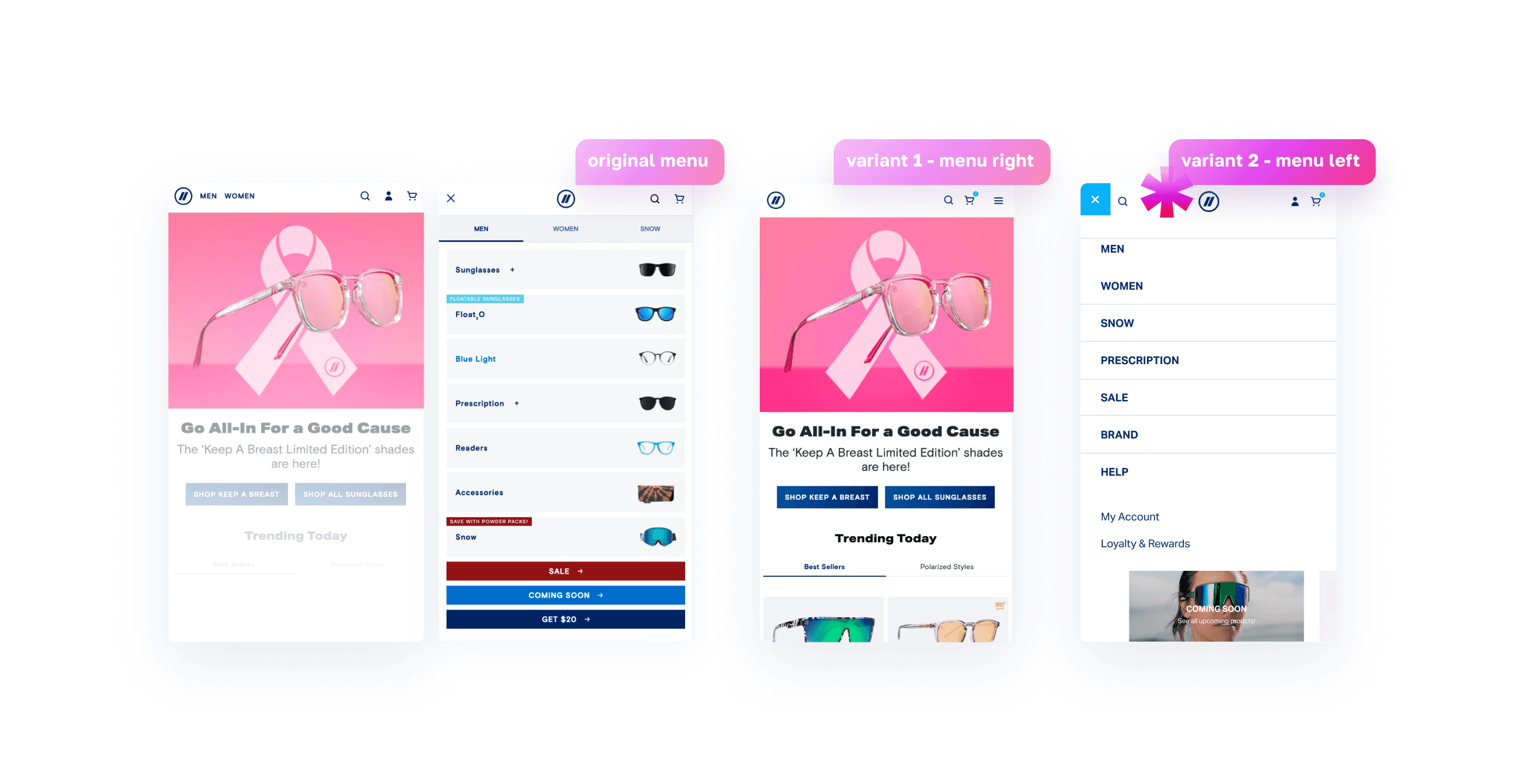
User testing (A/B testing)
+
Low and high fidelity wireframes
+
Cross-functional team collaboration
+
UI and UX design
+
Client communications
+
Interactive prototypes
+
App design style guide creation
team
+
+
+
+
+
+
Roman Serebryakov (Lead UX/UI Designer)
duration
4 months
Taylored Expressions is a very small but efficient e-commerce operation that is run by Taylor VanBruggen (client & product owner), so it was crucial to engage with Taylor and key team members to understand the business goals, user needs, and current pain points with the existing website through the whole project lifespan.
My responsibilities were:
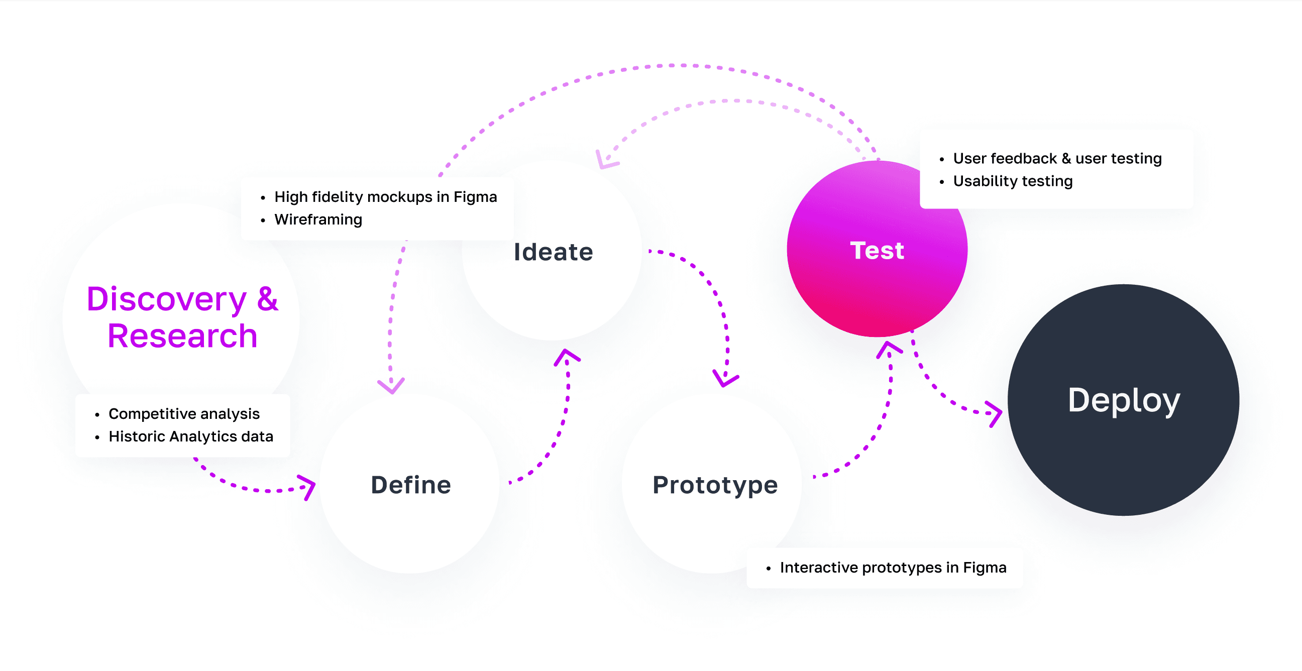
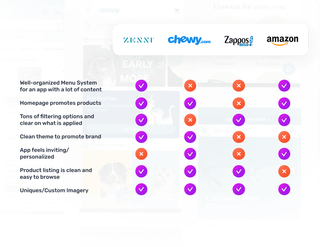
Analyzing competitors’ mobile apps to identify best practices and opportunities for differentiation.
Establishing clear objectives for the app, such as improving user experience, increasing engagement, and boosting sales.
Creating low-fidelity wireframes to outline the app’s structure and layout, focusing on intuitive navigation and user flow.
Developing high-fidelity prototypes to visualize the app’s look and feel, ensuring it aligns with Taylored Expressions' branding.
Implementing a feedback loop with users to identify any issues and make necessary adjustments before the official launch.
This process ensures a user-centered design approach, aligning the app’s features with customer needs and business goals, while maintaining the brand’s identity and operational constraints.

Design is as much a matter of finding problems as it is solving them.
+ Bryan Lawson
Taylored Expressions already had a lot of Google Analytics and user data from their online website store account additionally to the data from BigCommerce platform. My job was to utilize and filter some of this data to narrow down optimal experience when deciding what main sections and product categories to focus on. It also emphasized that majority of users preferred shopping on their mobile phones over desktop.
Of customers shop on mobile devices
35
Organic traffic to website
80%
Revenue increase since switching to mobile-friendly website
11%
The goal for this analysis was to look and analyze other e-commerce apps to identify best practices, opportunities for differentiation, and potential gaps in the market to create a superior user experience and gain a competitive edge.
_01
landing page & categories
Come up with a solution that will give a clear visual representation and intuitive design for main categories of products either through image treatment, readable typography treatment and color variation to lead into the product listing.
_02
product catalog listing
Focus on making featured product listings that give a quick glance of the most important product information: title of product, price and rating, make it obvious they are clickable by users to take them to Product Landing Page to learn more information and make a purchase.
_03
multi-level navigation & customization
Create a multi-level navigation solution that works with multiple levels of categories without distracting from shopping experience. Design a quick filtering option to allow more personalized viewing experience on category listing view, and help narrow down the list to what the customer wants or is looking for.
_04
personalized experience
Offer a customized experience by allowing registered users to create custom Wishlists of products, have easy and quick access to add or edit new lists. Offer a separate section for loyalty and rewards programs, incentivize users to use rewards to buy more products
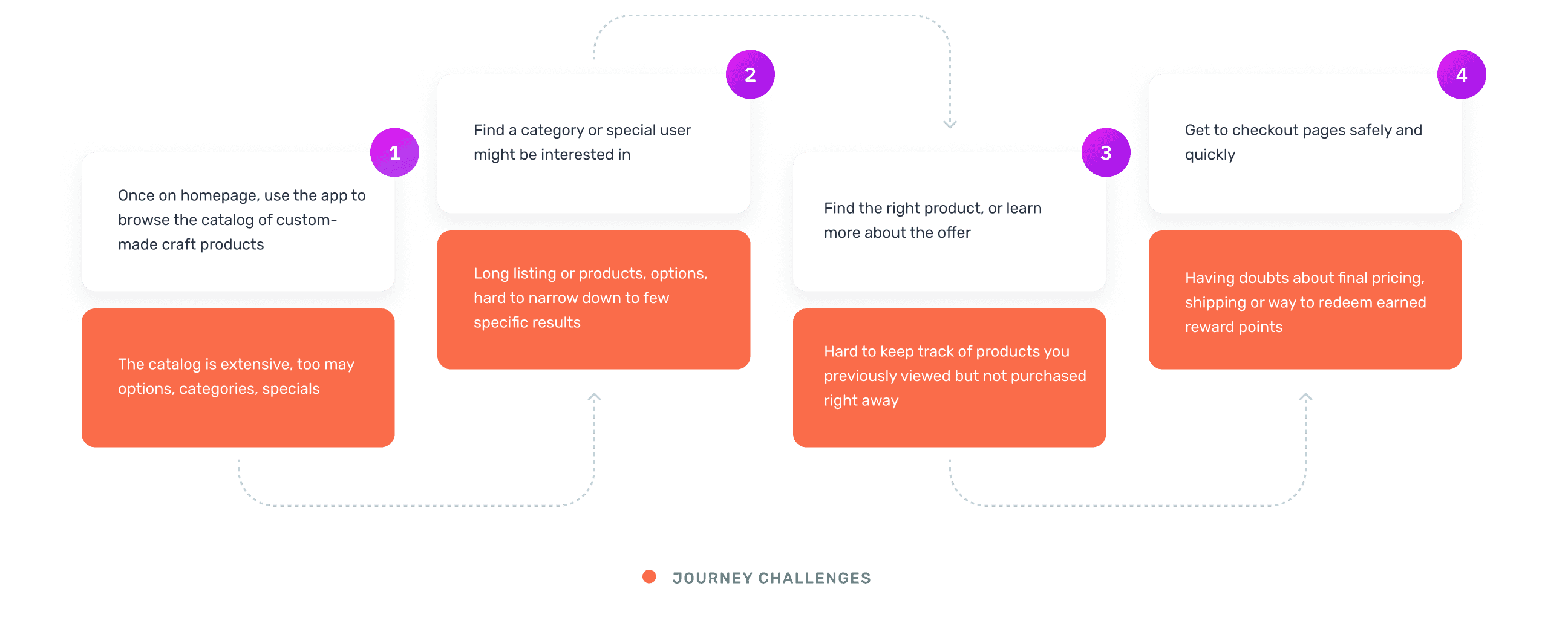
The goal of a user journey mapping for the app was to visualize and understand the user's experience and interactions with their online shopping experience, identifying pain points and opportunities for improvement to enhance overall user interactions for the app.
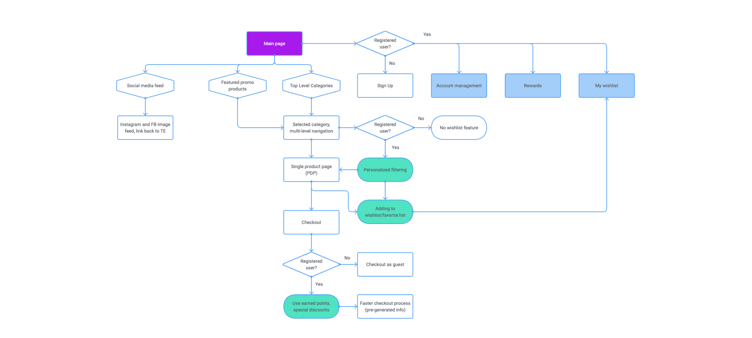
I wanted to design a sitemap for a mobile app to help outline the app's structure, ensuring intuitive navigation and efficient organization of content and focusing on the user experience by providing a clear, logical path to access various features and information.
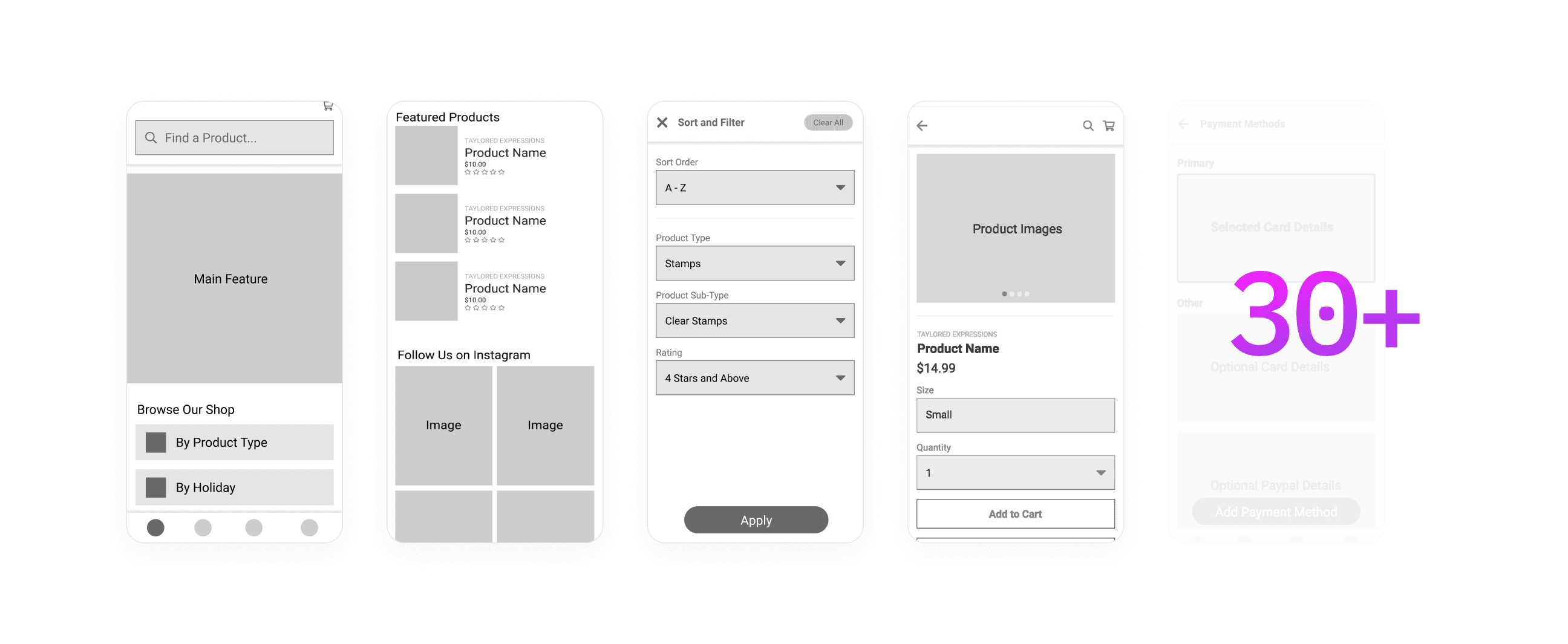
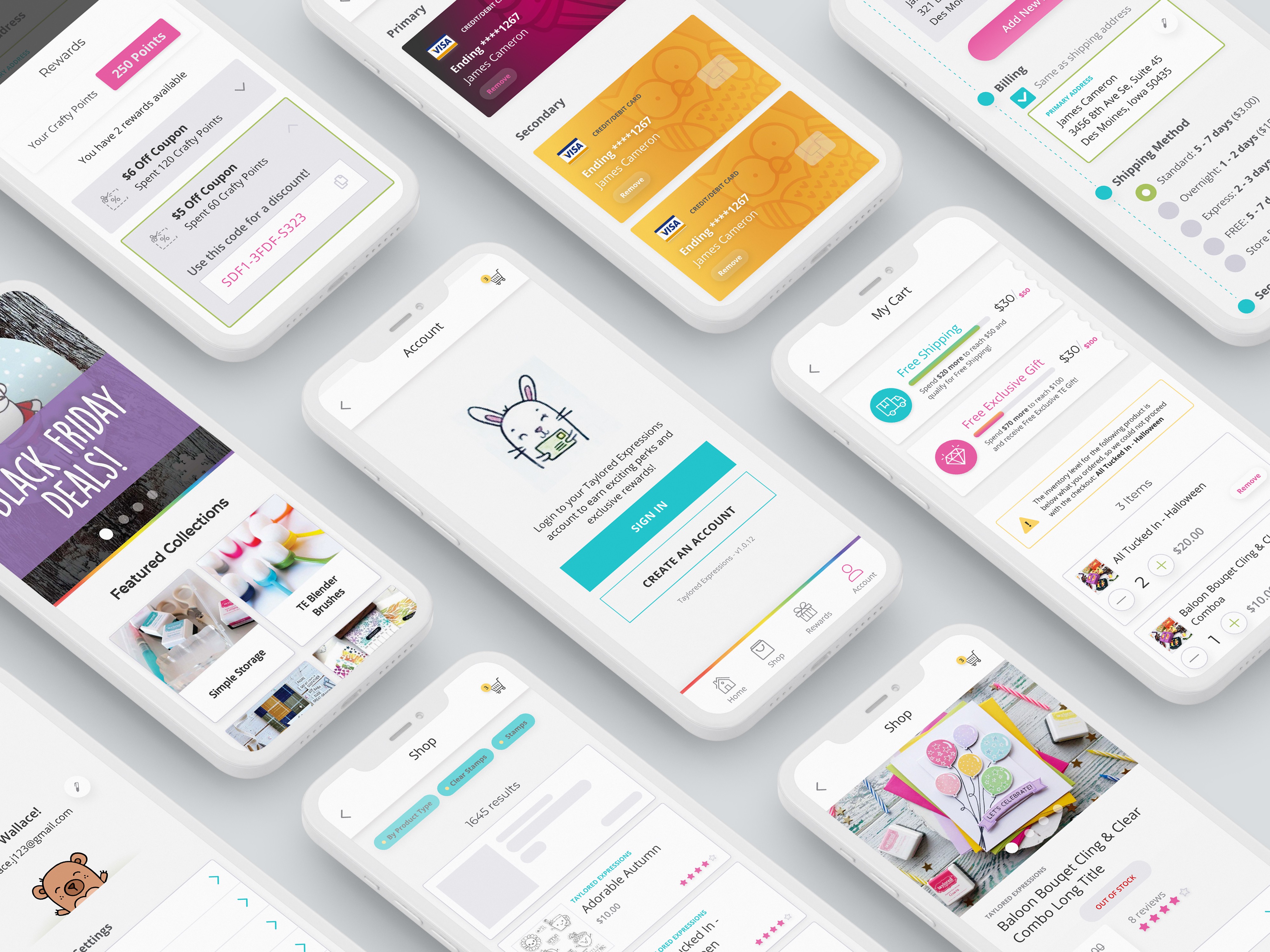
Based on the focus of solutions described above, I used Figma to create over 30 various screens to showcase a visual layout and hierarchy that outline the app's navigation and interface elements, ensuring a clear, logical structure that enhances the user's shopping experience. It helped me focus on usability and functionality, identifying potential issues and optimizing the user flow before moving on to detailed visual design and development.
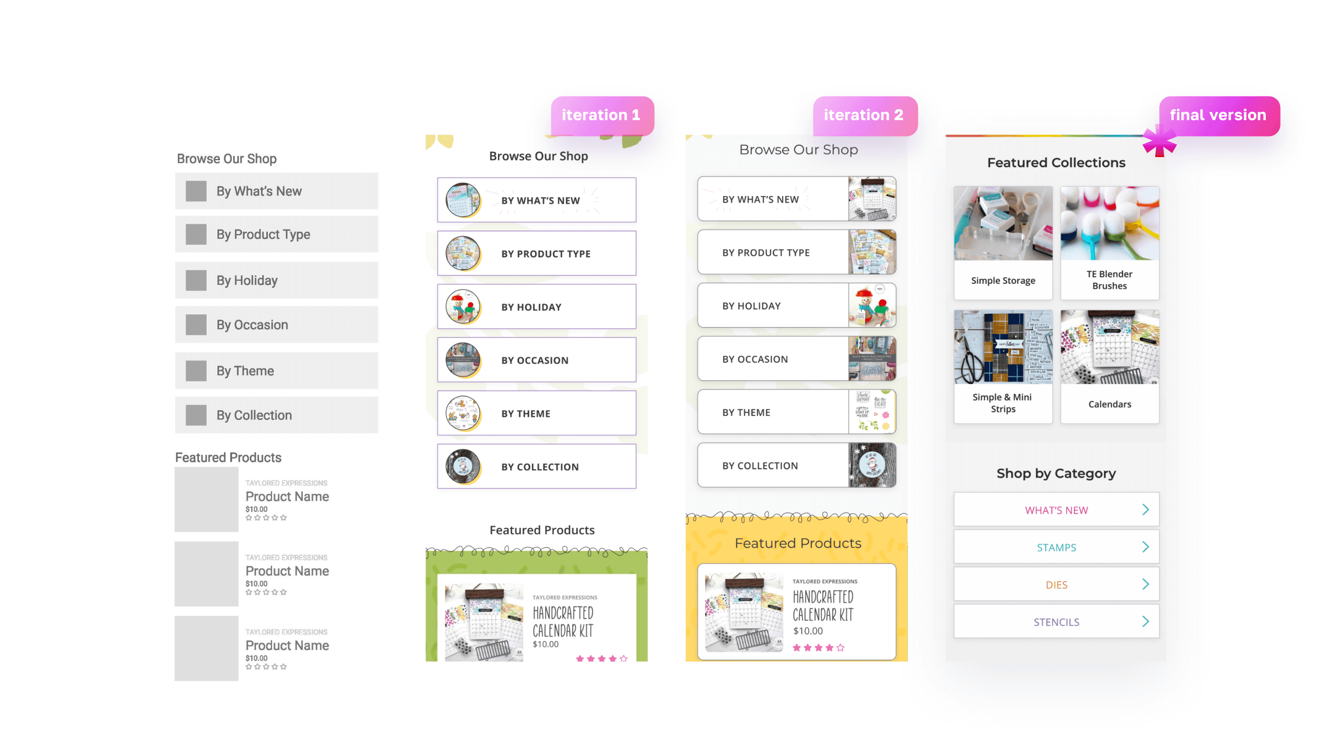
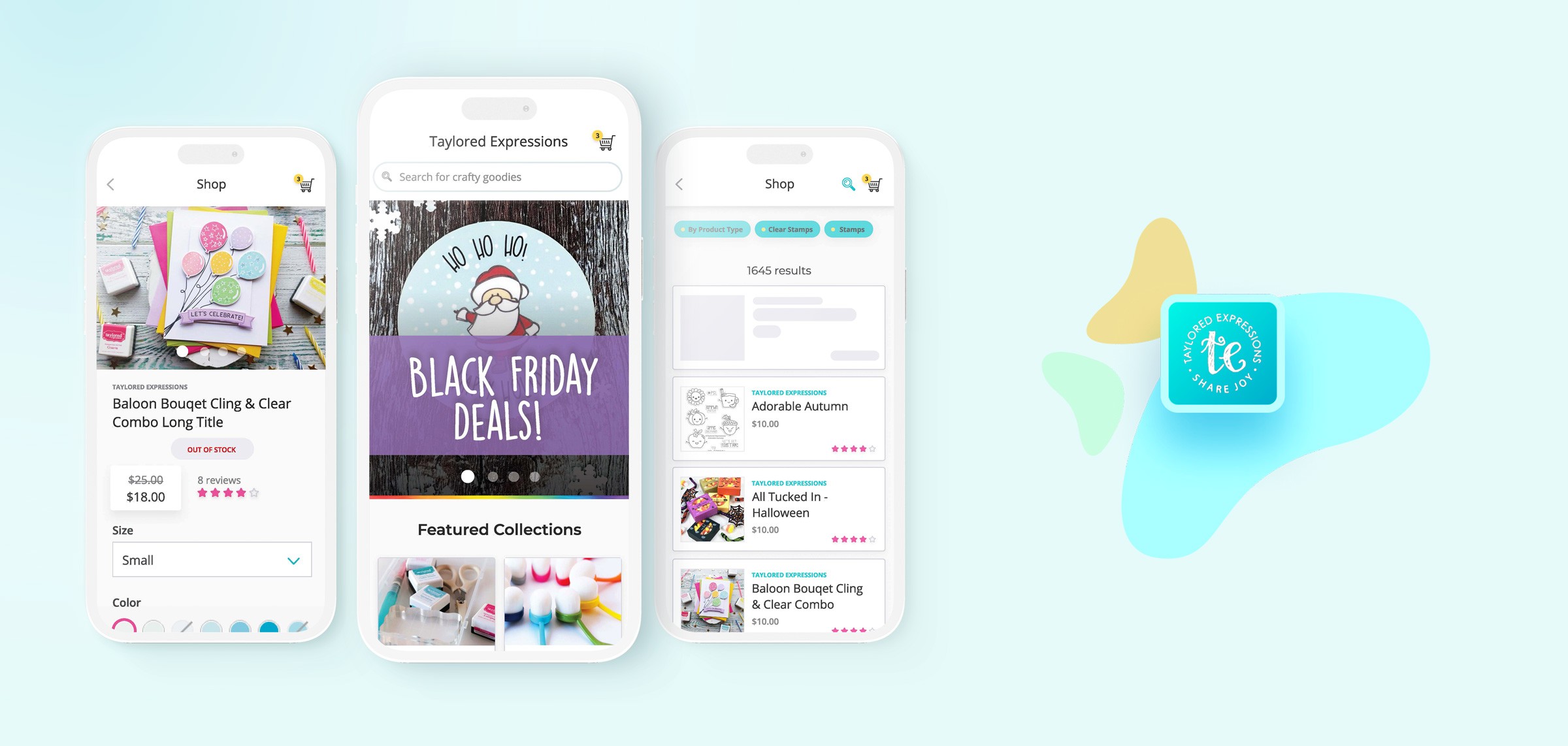
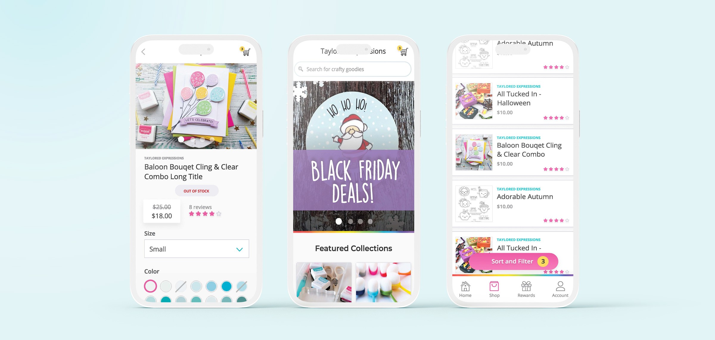
I explored various treatments and styles for the main shop and Featured categories, using image thumbnails of top products to encourage users to click into each category, while also experimenting with different typography. Initially, I considered incorporating brand-themed illustrations, but the final design, refined based on user feedback, is cleaner and offers a smoother experience that I believe will be more successful.
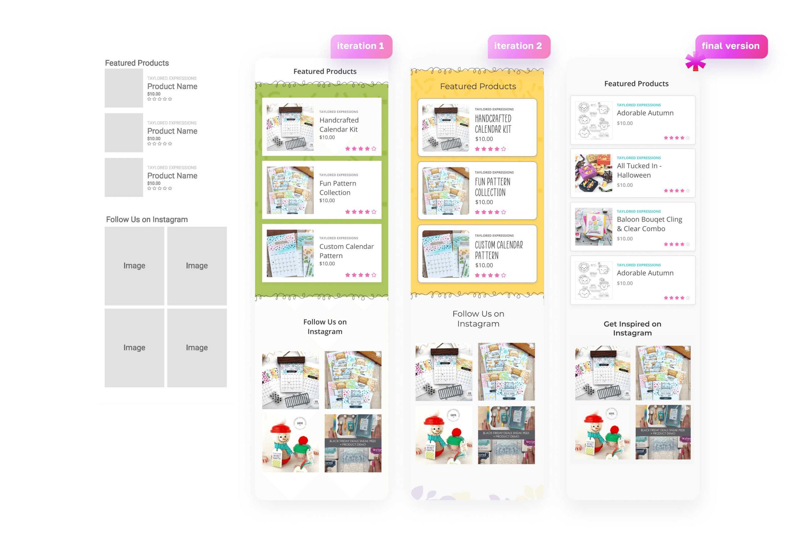
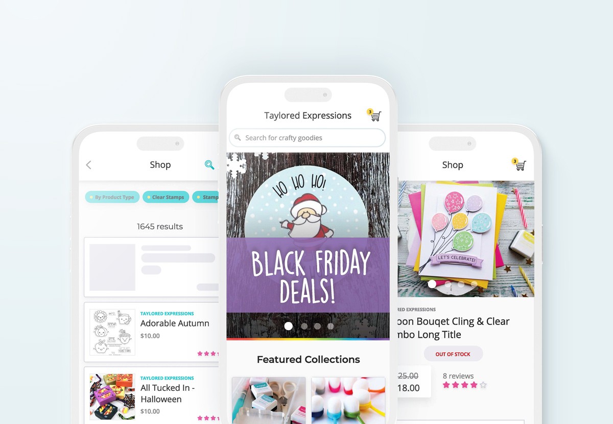
I aimed to create a solution that prominently features top-selling or promotional products on the main and category pages. My goal was to use vibrant colors to capture users' attention and encourage them to explore the products further. I chose an explicit card design to present actionable information for each product clearly.
From the outset, I included two key features: product ratings and price, ensuring the design remained simple and readable for users.
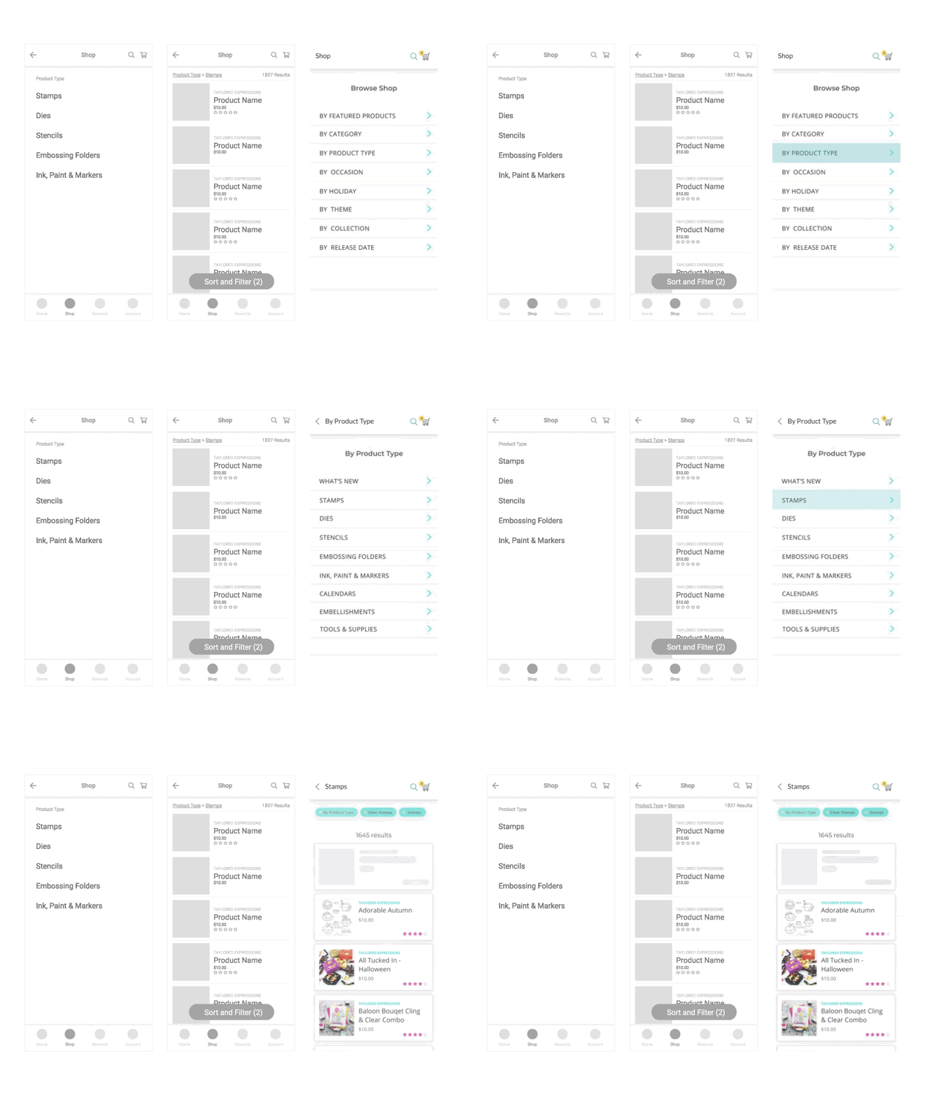
To address the challenge of multi-level product categories, I chose a full-screen flat menu design pattern. Given that Taylored Expressions' categories can have up to four levels of hierarchy, my goal was to create a simple and clear user experience without visual distractions.
This design allows users to view all product collections from top to bottom seamlessly, helping them stay focused on finding the right product. Additionally, users can easily navigate back to previous categories by clicking the back arrow at the top left.
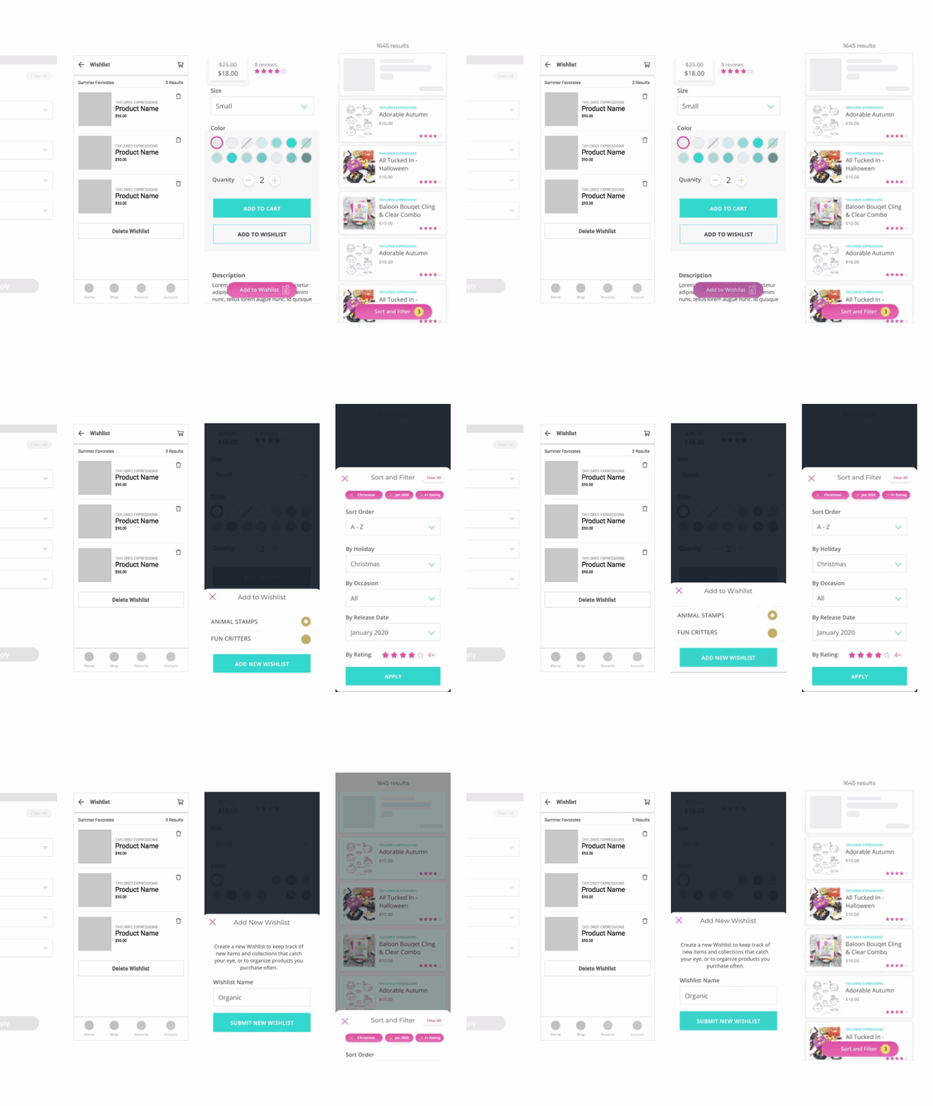
Custom wishlist & filtering
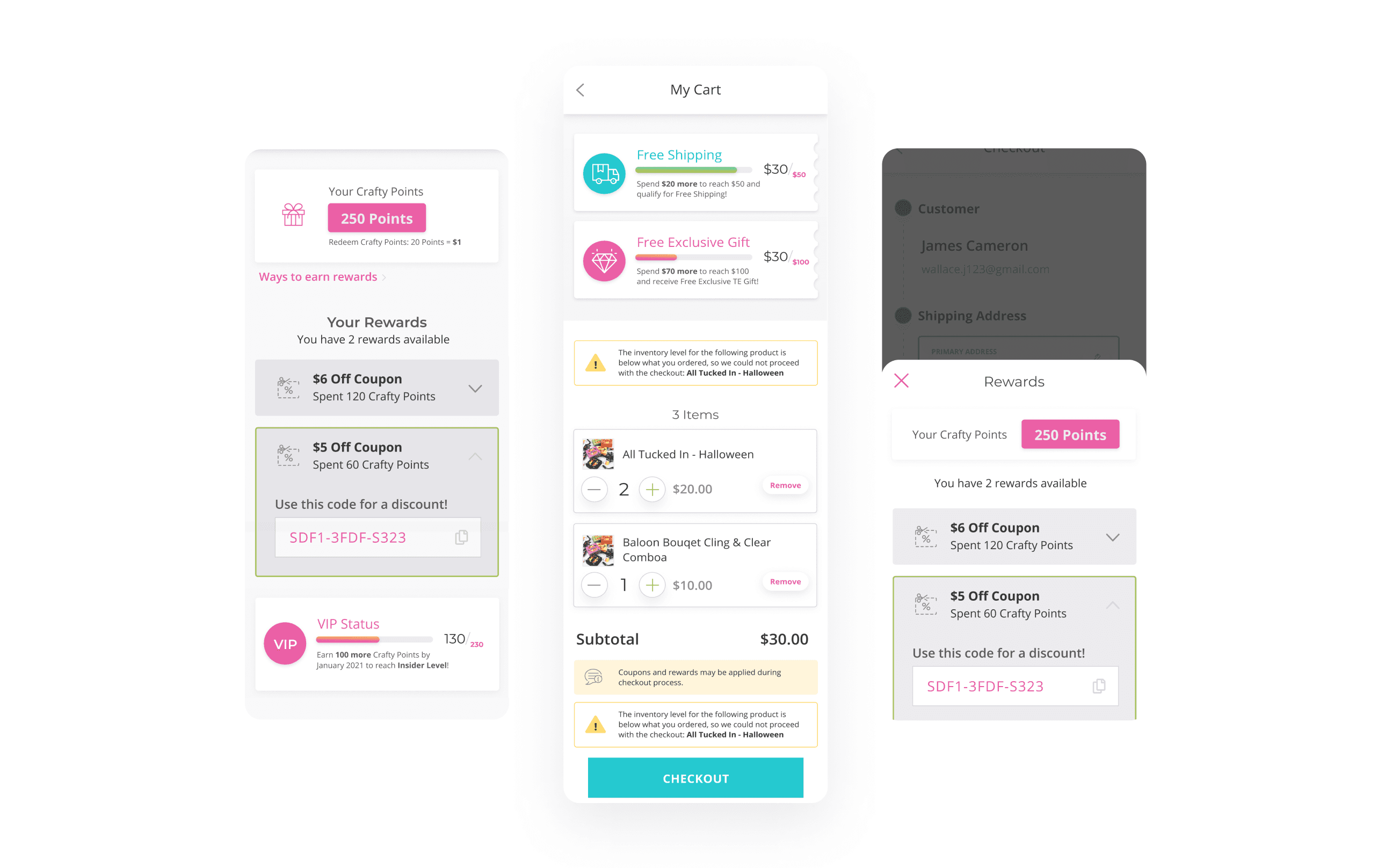
The Loyalty and Rewards sections were designed to boost repurchase rates, encourage customer signups, and provide discounts to loyal customers, thus serving as an additional sales channel. Features like earning points for sharing on social media or referring friends increase brand recognition and attract new customers, reducing marketing and acquisition costs. Integrating loyalty rewards is crucial for fostering customer retention and engagement, making the shopping experience more enjoyable and promoting word-of-mouth marketing.
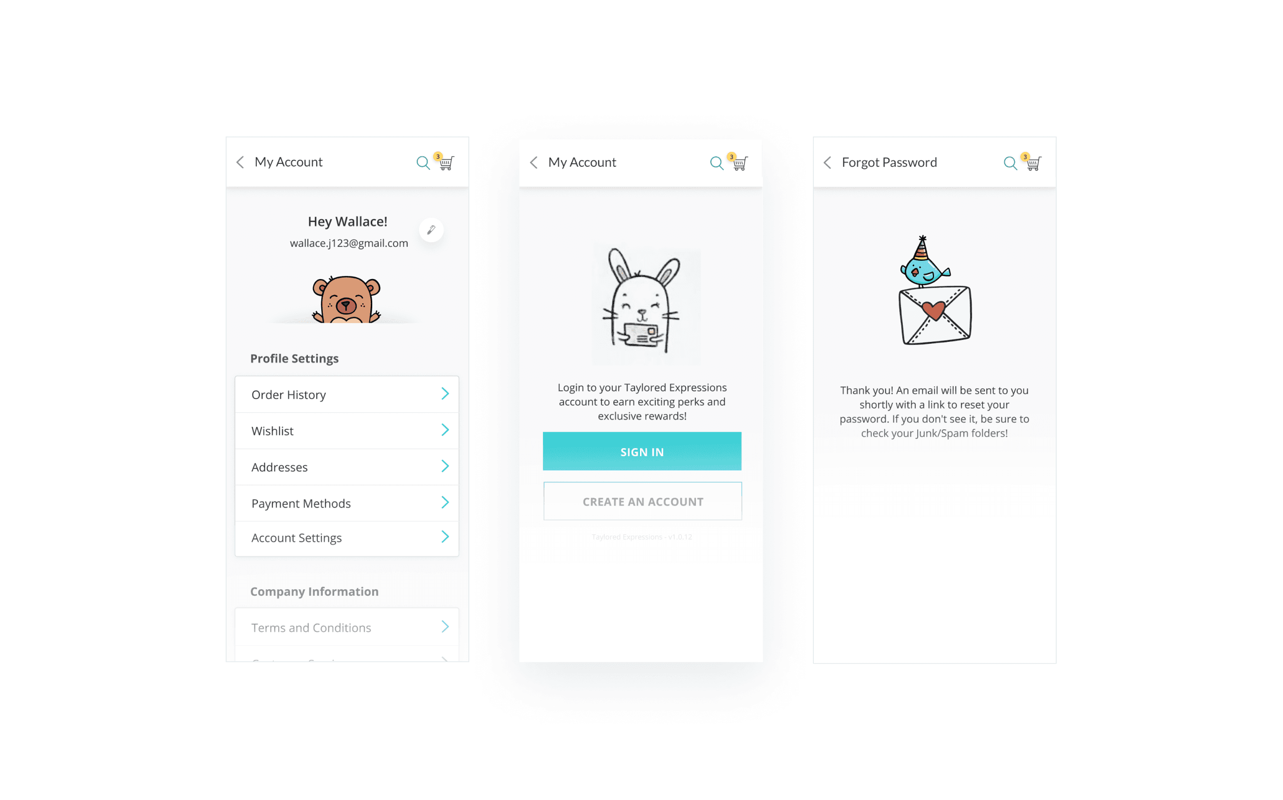
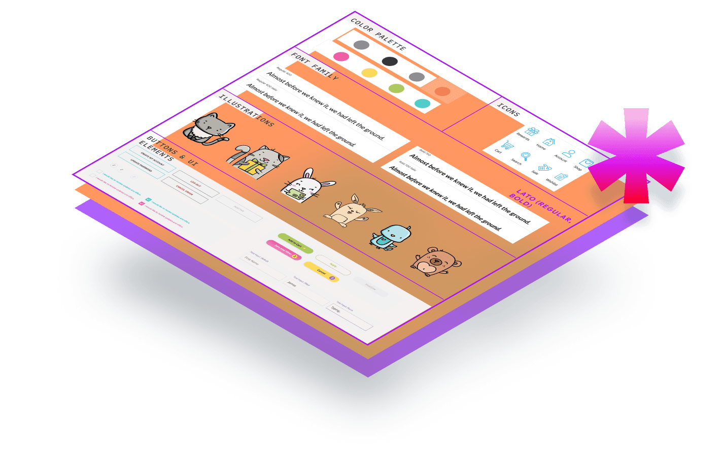
Taylored Expressions features a diverse range of custom-made character illustrations used across their product line and branding. To extend their mission of "helping you live life with joy and creativity," I integrated some of these illustrations into the mobile app user experience. The client loved this idea.
I incorporated a few characters into the account management and ordering process to make the app more unique, personable, and fun.
More personalized content experience: the app could benefit from more promotional campaigns tailored to the user by using suggested products and special discount section based on historic buying behavior. Also, the app needs to utilize the video content: TE produces it on regular basis on social media where they feature new product lines or how-to educational tutorial videos which could lead to more engagement and product purchases for new and returning customers.
check out Other projects:

