Animal Crossing: UX/UI Redesign Case Study
Case study for in-depth UX/UI analysis of Animal Crossing, the Nintendo video game that has over 11 million monthly users. My goal was to research, enhance and design a better UX and UI. This was part of intense 8 week UI/UX in Gaming course from ELVTR (Ivy Sang).
Overview
Main purpose of this case study was to utilize foundational UX design principles and visual design strategies to revamp Animal Crossing, concentrating on refining navigation flow, enhancing inventory management, and elevating gameplay interaction elements, as a final outcome of an ELVTR UX/UI in Gaming course project.
Main purpose of this case study was to utilize foundational UX design principles and visual design strategies to revamp Animal Crossing, concentrating on refining navigation flow, enhancing inventory management, and elevating gameplay interaction elements, as a final outcome of an ELVTR UX/UI in Gaming course project.
Challenges
Short timeline: only 8 weeks from kickoff, user research, testing to finishing all UI designs for final output
To learn and get familiar with UX processes for video game platforms
6-hour weekly commitment to study class material, research, and complete course assignments
Learning game mechanics, rules, and user base for the Animal Crossing
Limited access to game art resources or 3D assets used in the game
Completely new style, mood, and and UI for the existing Animal Crossing game
responsibilities
+
UX research
+
User testing: usability
+
User flow design
+
UI design, Motion graphics
+
Paper prototypes
+
Accessibility Testing
+
Low fidelity wireframes
+
Style/visual guide design
team
+
ELVTR Gaming (Project Owner)
+
Ivy Sang (UX/UI Mentor, Blizzard)
+
Juan Morales Patino (UX Mentor, Bungie)
+
Roman (UX/UI Designer)
duration
8 weeks
Project process & flow
Project process & flow
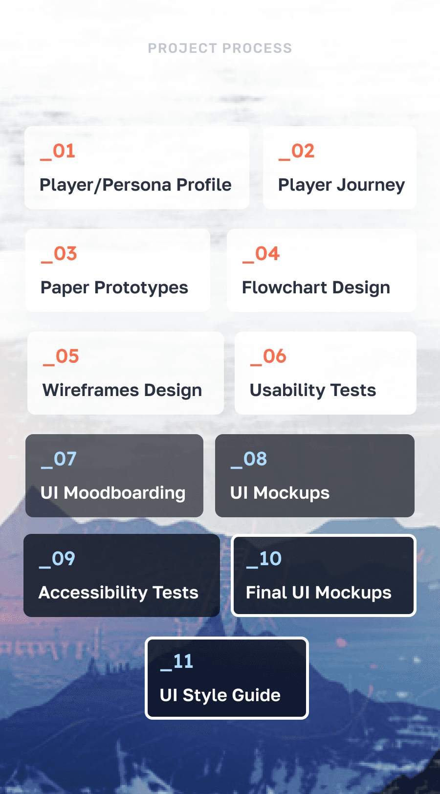
In the UX/UI process for Animal Crossing, I initially studied player interactions: welcome dialog screens, customization options, pre-game choices, character engagement, and learning through gameplay. To enhance this experience, I crafted user journeys, paper prototypes, and streamlined user flows.
Progressing, I developed wireframes to structure the game's screens and functionalities. Usability testing with these prototypes gathered early feedback, aiding in refining wireframe concepts.
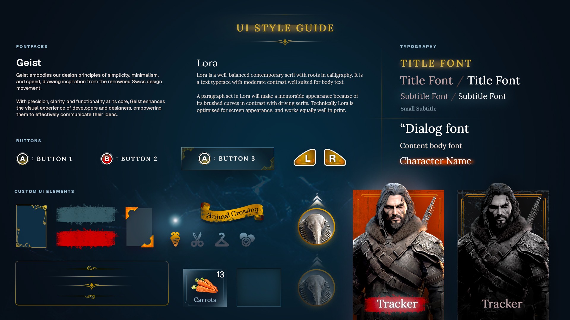
Ensuring inclusivity, I focused on accessibility, offering diverse control schemes, text size options, and color contrasts meeting colorblindness requirements. Finally, I established a UI style guide for consistent design elements across the interface, ensuring a unified user experience throughout the game.



As a UX/UI Designer, our job is to present and teach rules of the game (app) in the most intuitive and clear way.
+ Ivy Sang (Blizzard)
Focusing on UX improvements
Focusing on UX improvements
_01
welcome/dialog screens
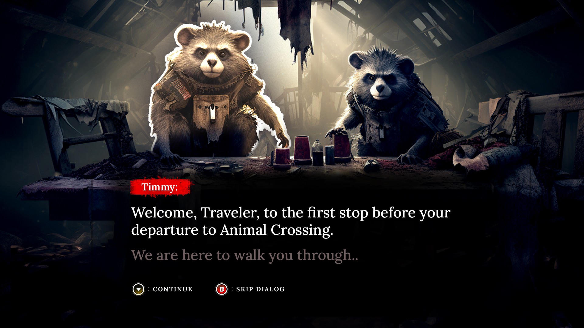
In aiming to enhance player experience and to make access to gameplay quicker, my goal was to optimize the initial welcome screens at the beginning of the game by reducing time and offering quicker pathways into gameplay adding to better gaming experience.
The goal for this solution is to make a structured, easy user interface to help shoppers navigate main and sub-categories for the store, get quick exposure to Specials/Featured sections. Reorganize content structure and make the mobile experience for navigating more straightforward and organic to the users. Offer quick access to support.
_02
avatar/character builder
As an opportunity for improvement, I felt like players don't have enough options to customize or have more choices for their character. I wanted to focus on some UX and UI improvements to make this screen more dynamic and fun.
_03
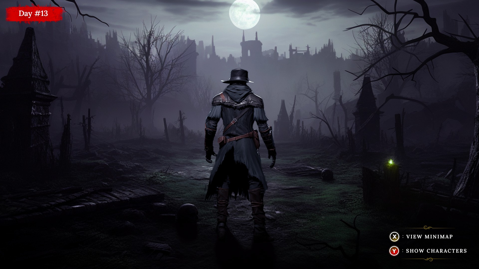
gameplay interface
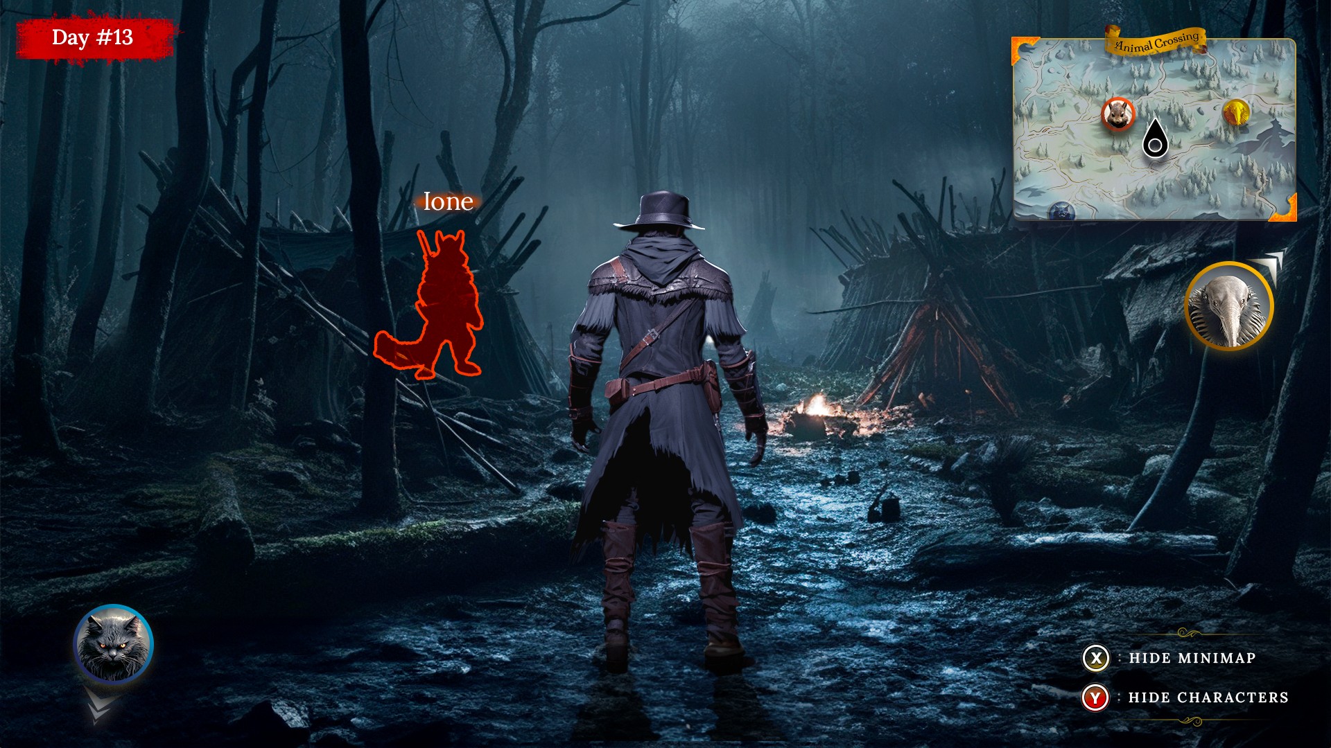
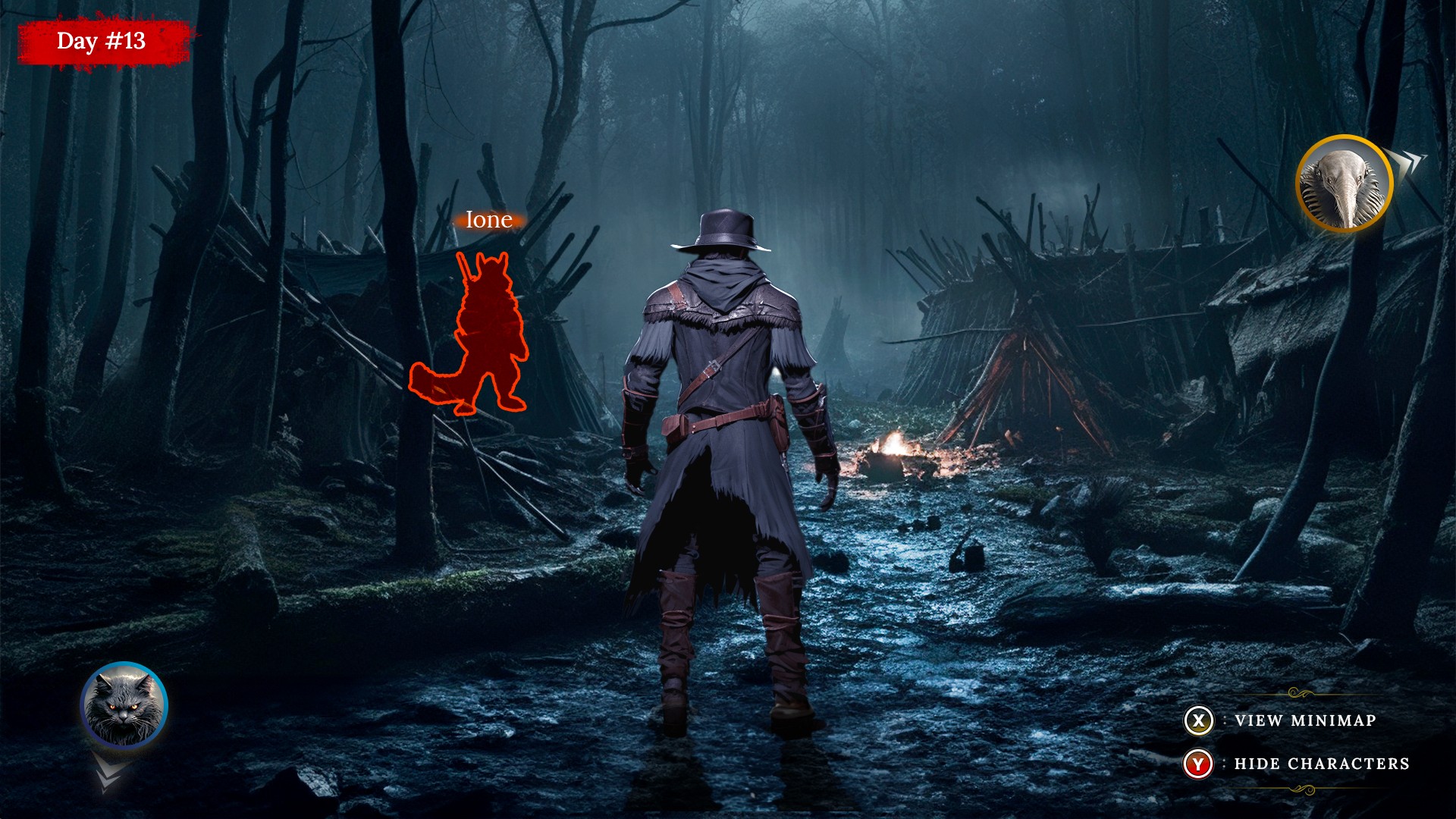
During gameplay, especially later in the game, players need to locate and interact with certain points on the map. I believe enhancing the gameplay interface to grant more control over what players see could significantly improve the overall experience.
_04
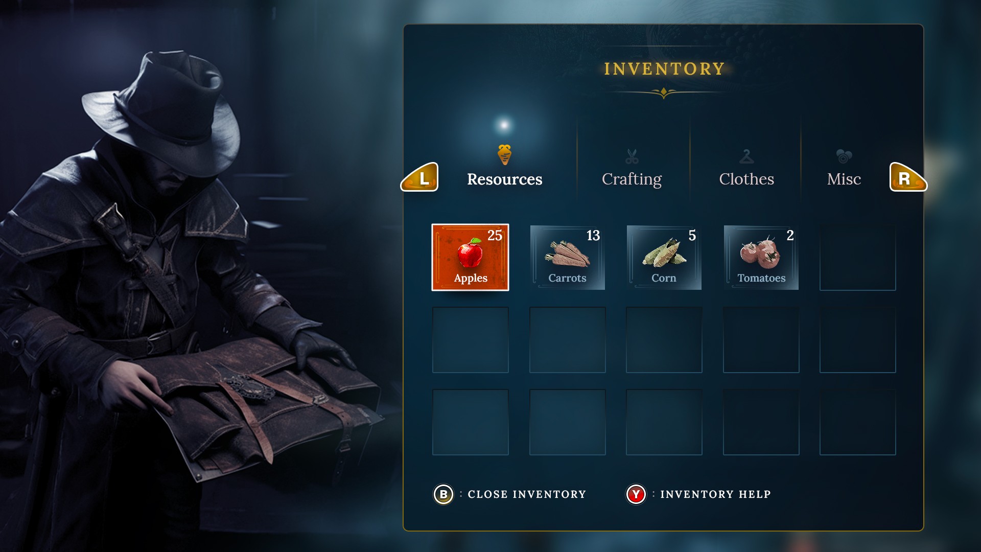
gameplay inventory screen
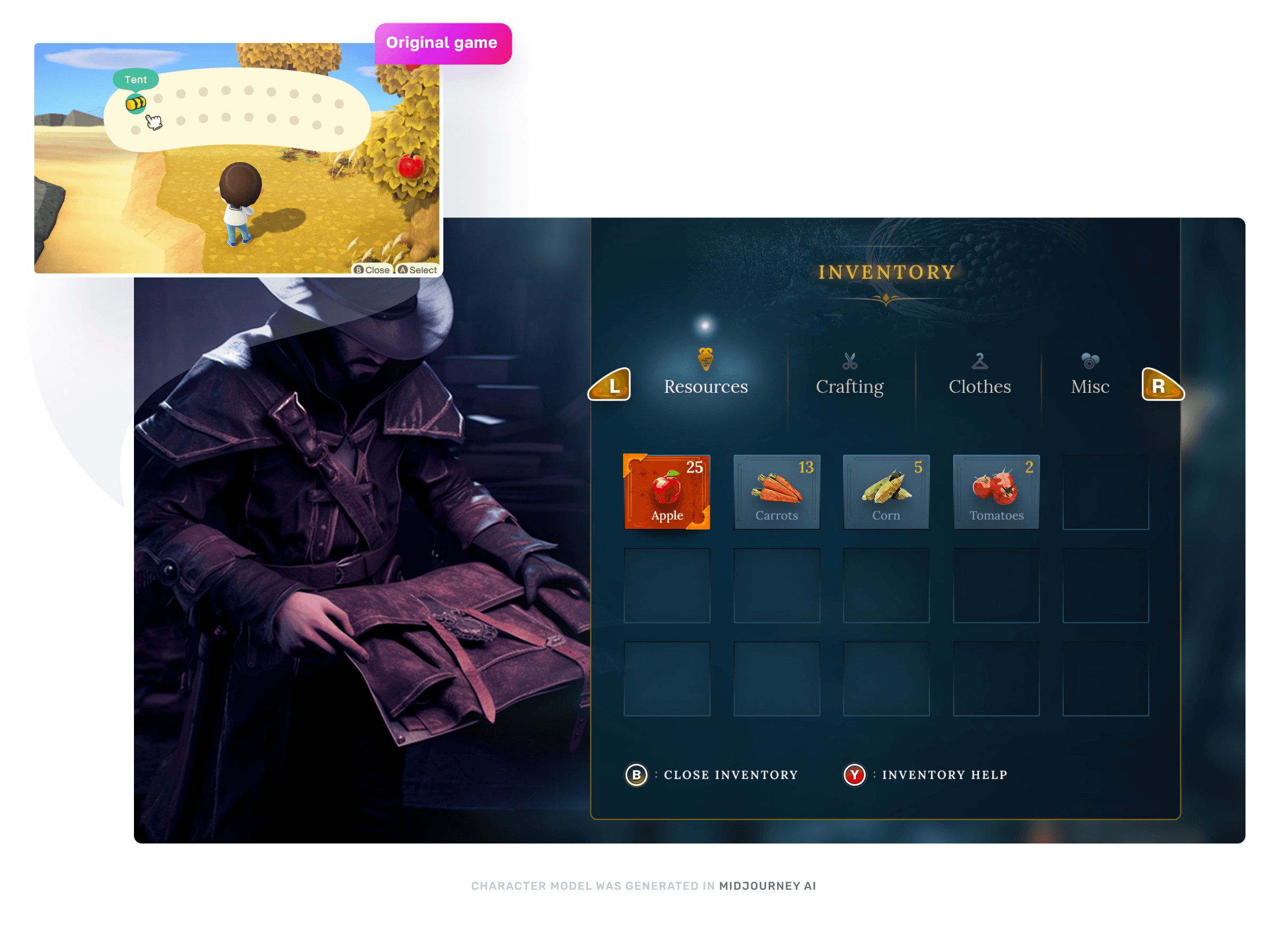
To improve player's experience for inventory screen, I wanted to focus on better sorting, categorization, filtering and adding more cues for selected items. I wanted to make it easier to identify and find specific items, while also allowing quick access to help section.
User testing
User testing
Participants for
usability tests
Participants for
usability tests
10
10
10
10
Total UX revisions to initial concepts
Total UX revisions to initial concepts
Total UX revisions to initial concepts
12
12
Usability test results collected
Usability test results collected
Usability test results collected
50
50
50

I utilized Maze.co as a primary testing platform to send interactive prototypes to the users. User could individually walk through each task and leave their responses and feedback based on the questionnaire they were given, while also having ability to leave open comment/suggestions.
I utilized Maze.co as a primary testing platform to send interactive prototypes to the users. User could individually walk through each task and leave their responses and feedback based on the questionnaire they were given, while also having ability to leave open comment/suggestions.
User Experience Design
User Experience Design
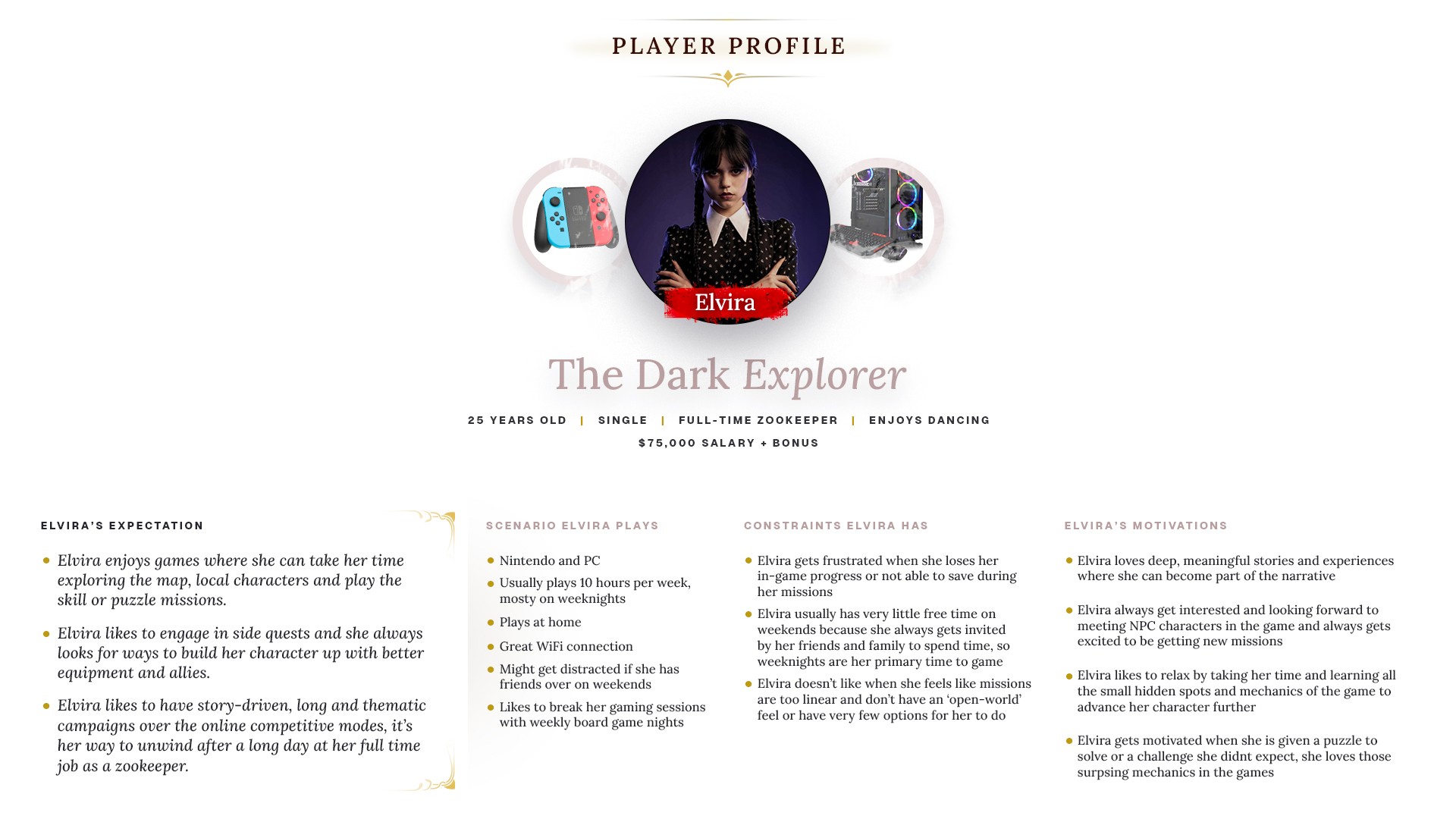
Defining Player Profile helped me identify the most common features of the gamers that the game is trying to attract and build the persona for the targeted audience. The whole purpose of this task was to put together potential opportunities and areas to focus on and able to tailor more to the users with the Animal Crossing mechanics to provide more enjoyable and memorable experience.
Defining Player Profile helped me identify the most common features of the gamers that the game is trying to attract and build the persona for the targeted audience. The whole purpose of this task was to put together potential opportunities and areas to focus on and able to tailor more to the users with the Animal Crossing mechanics to provide more enjoyable and memorable experience.
Player journey
Player journey
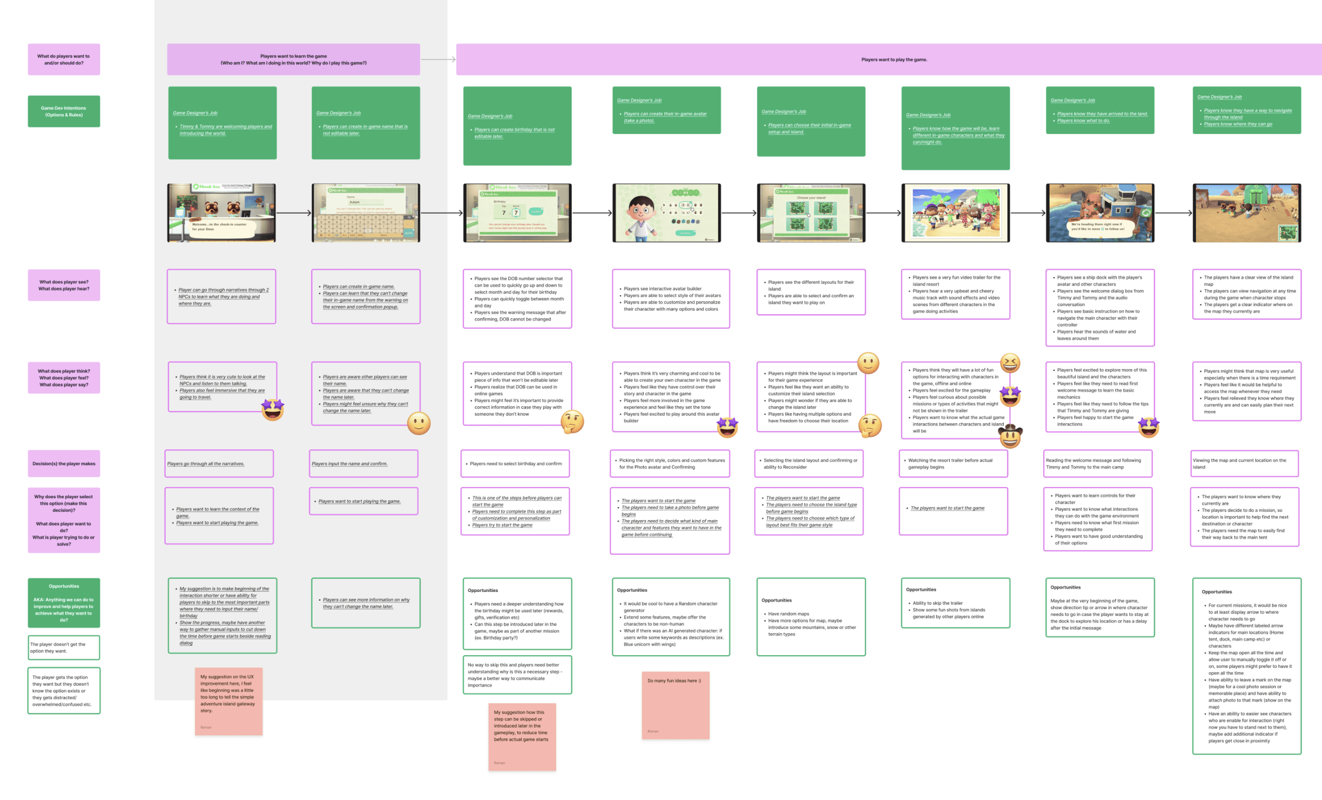
The fundamental questions that were answered during this process were:
What does the player see, hear, feel, think, and say?
The Player Journey for the Animal Crossing let me to think and put together experiences players encounter while engaging with the game including onboarding, progression, interaction, challenges, and retention. By mapping these points, I was trying to gain deeper insights into player goals, intentions and their emotions, giving me better idea of overall user interaction flow.
Player Journey also let me think about how to communicate Game Dev's intentions to the players and what friction points might exist in-between that could also be improved.
Figma link for view full UX study.
Paper prototypes
Paper prototypes
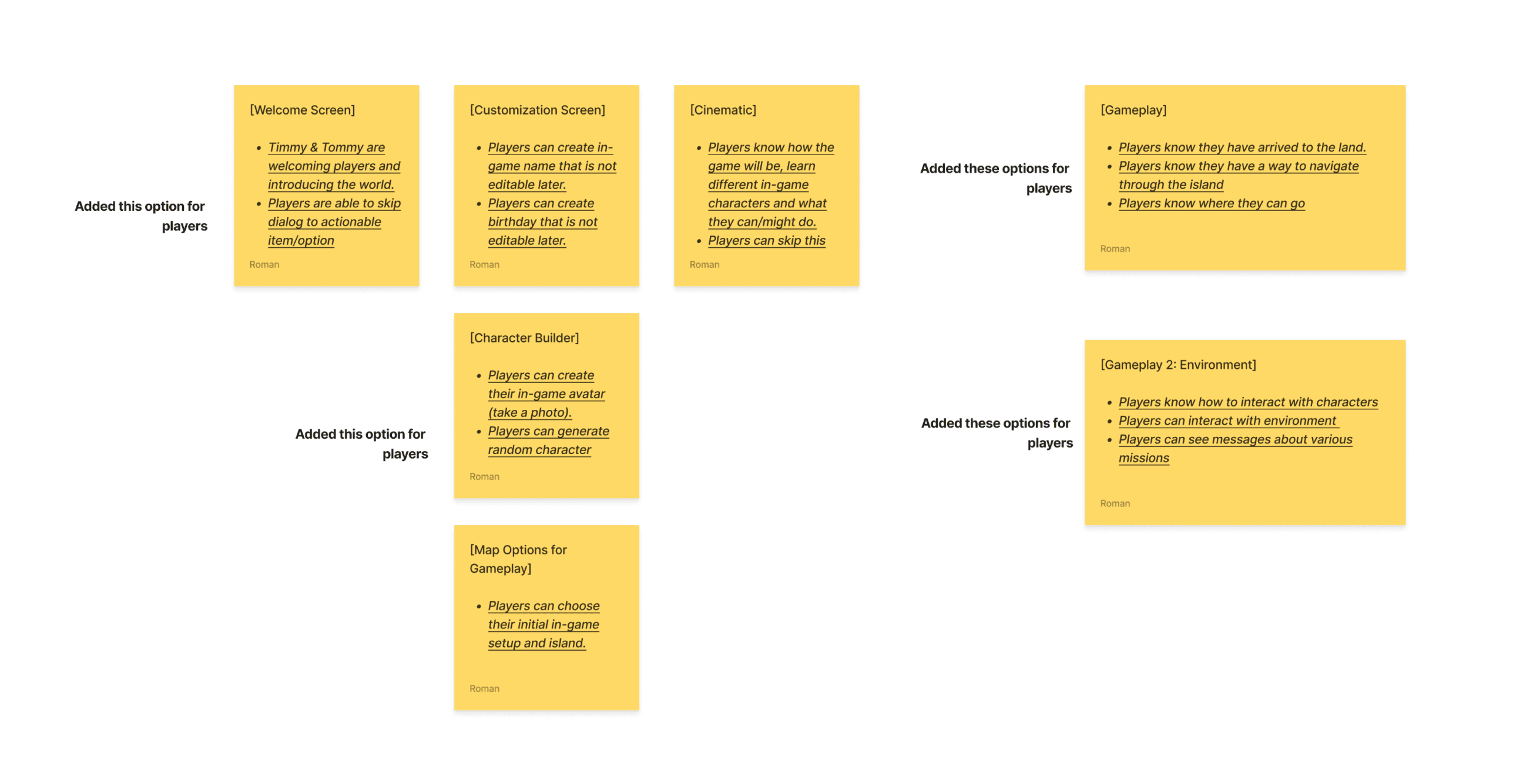
Paper prototyping is a UX technique to organize information into specific screens. By using sticky notes, I have listed and grouped together common features and options players have into the screen-by-screen basis to allow me better view and understabd the overall user flow. At this phase I have added couple of potential UX enhancements:
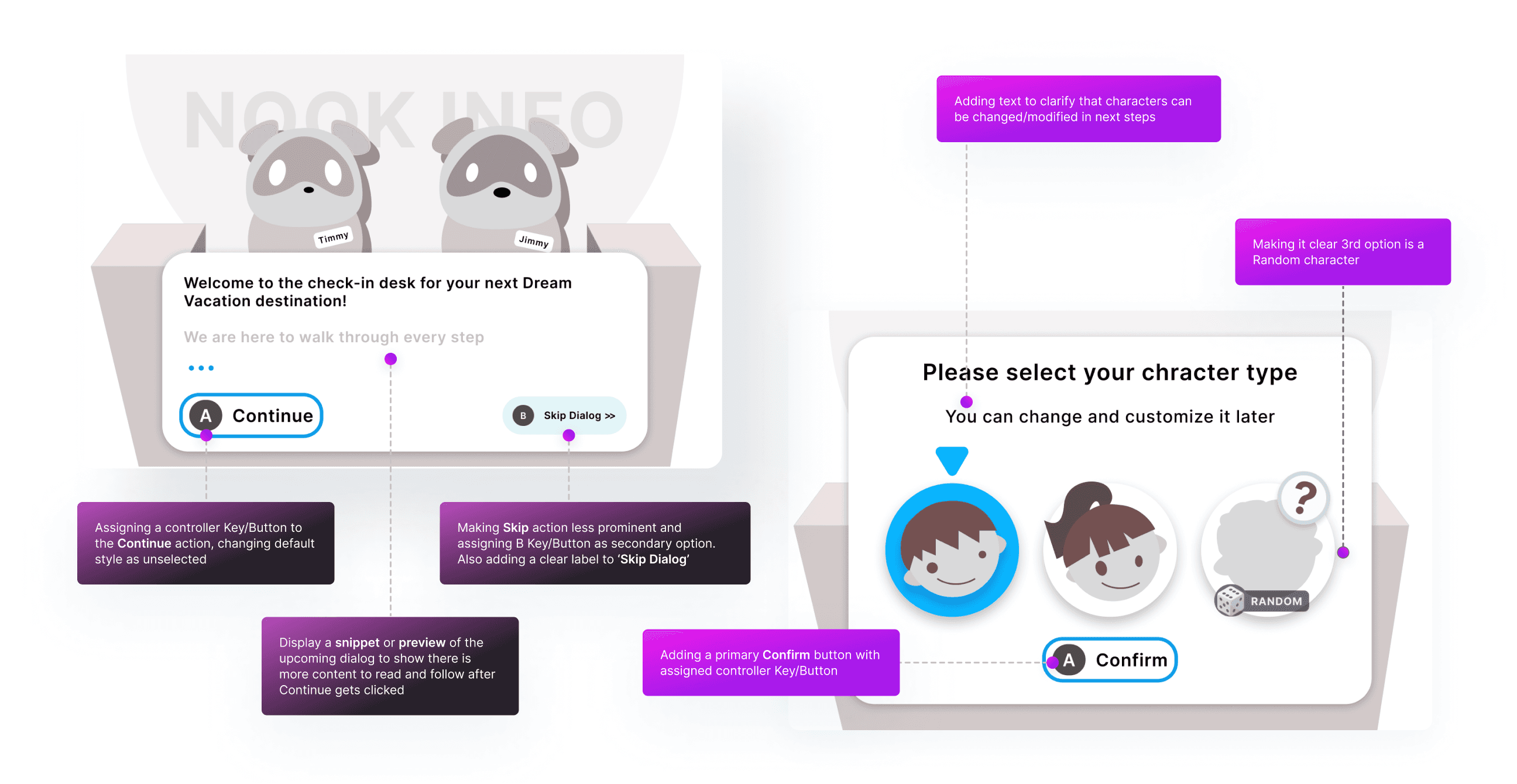
Adding random character option on the character selection screen
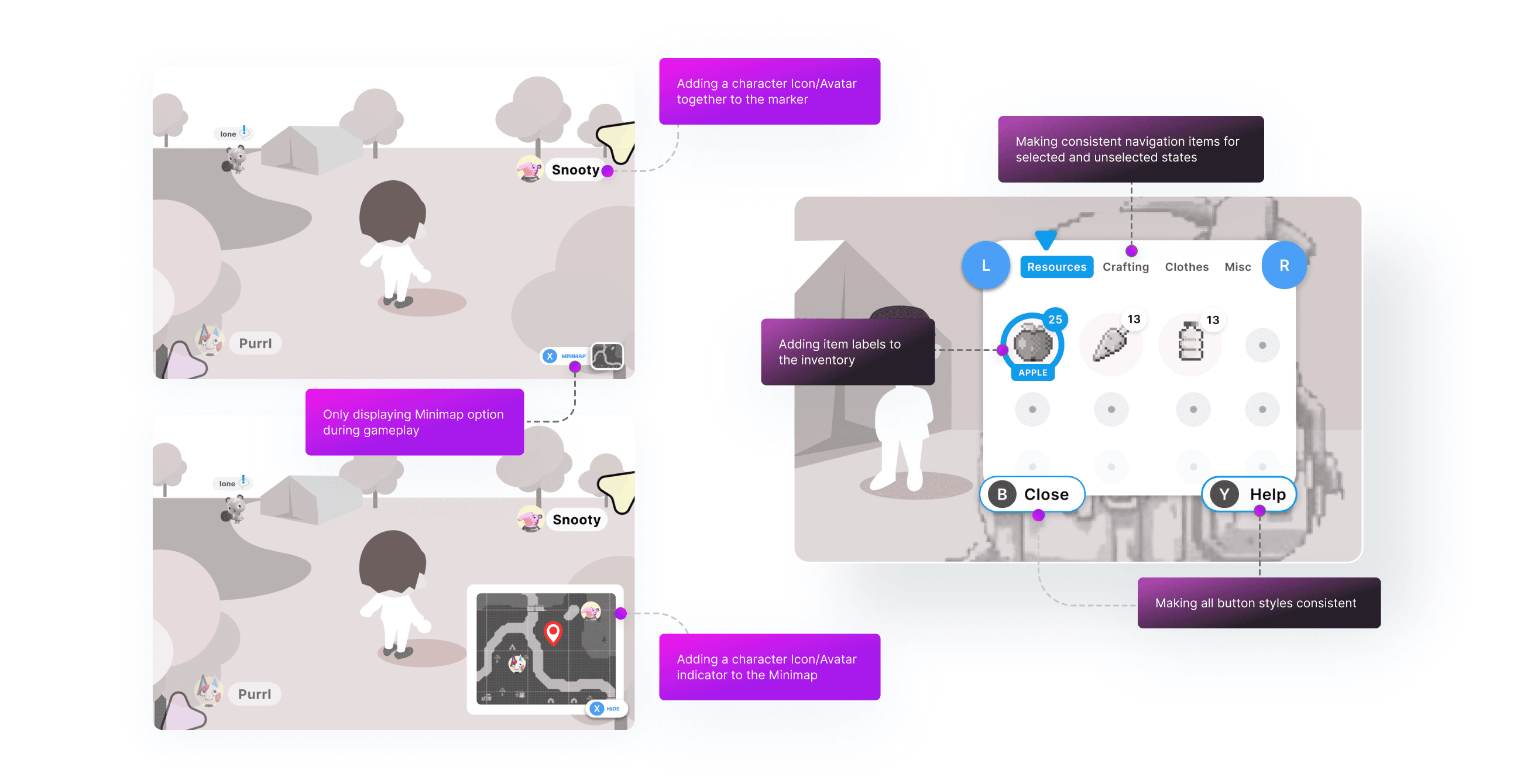
Adding a way for player to easier identify character and points they are able to interact with
Players are aware where they are able to go in the game based on visual indicators or tips
Flowchart design
Flowchart design
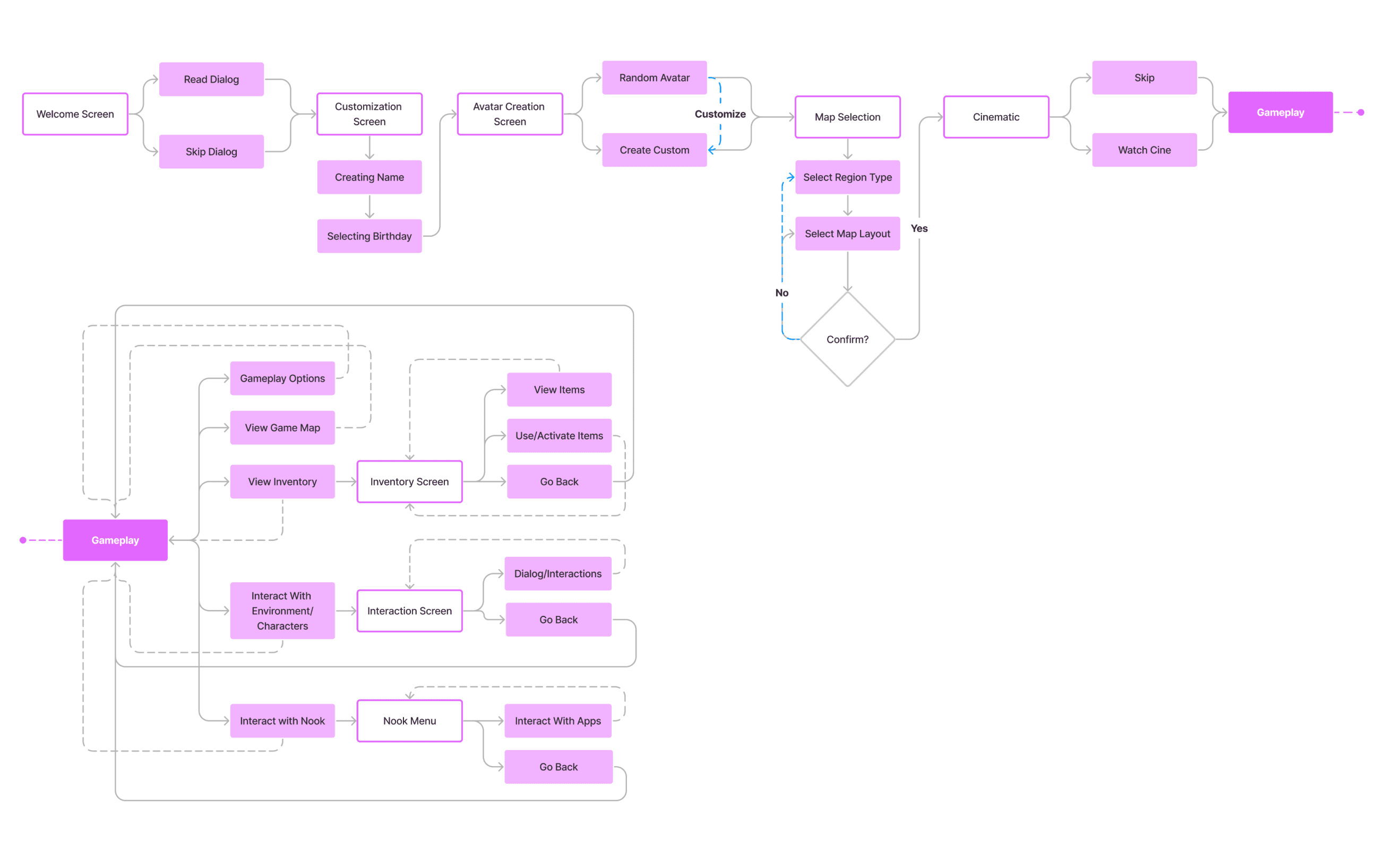
After Paper prototyping, I have created a detailed Flowchart to illustrate the sequence of actions, decisions, and interactions that players experience throughout their gameplay journey. Flowcharts helped me to visually map out the game's structure, outlining the various paths, choices, and connections between different options.
Figma link to view Paper Prototypes and Flowchart.
Initial wireframe designs
Initial wireframe designs
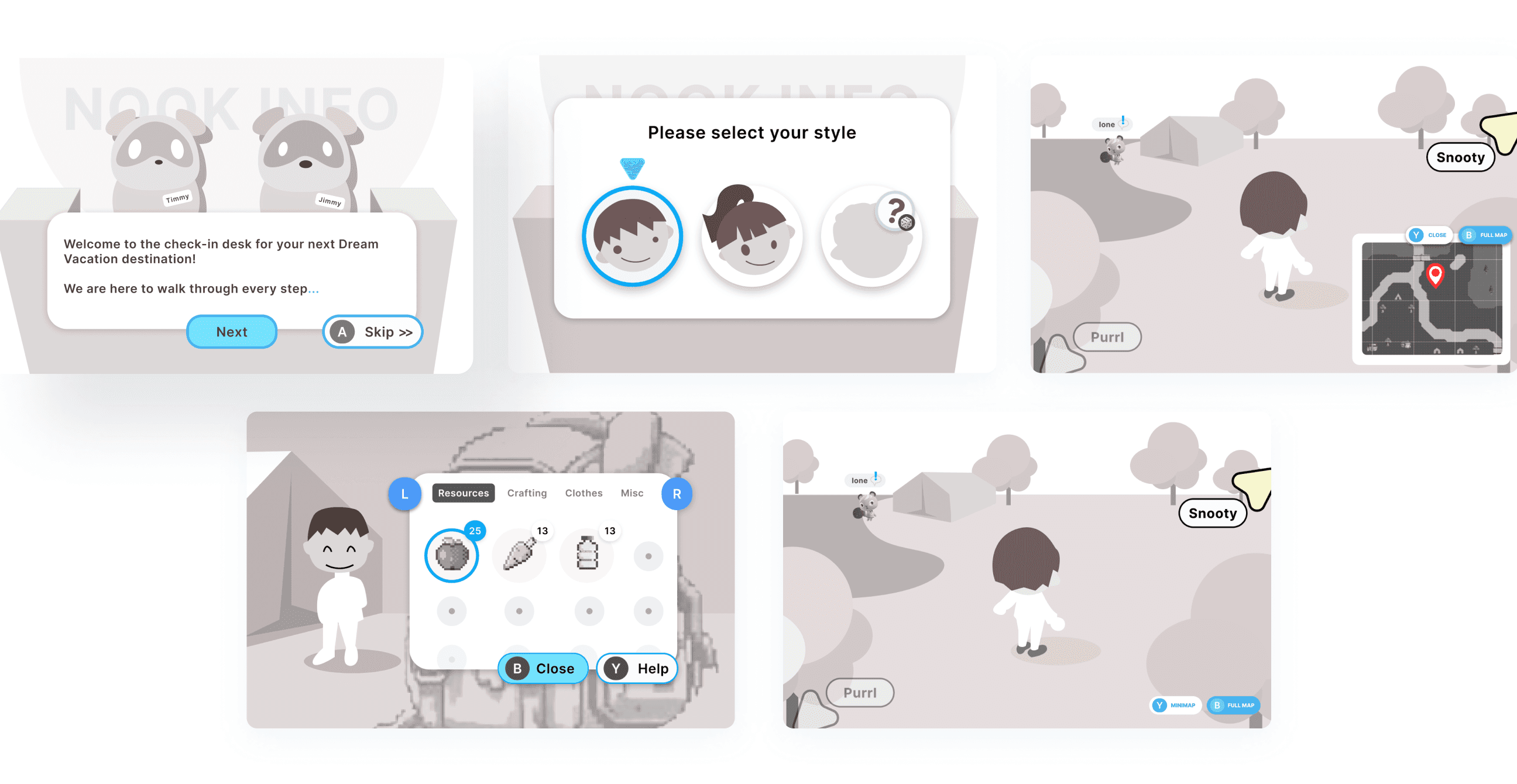
In crafting wireframes, I prioritized enhancing UX on the specific screens. Leveraging the Journey Map, I tried improving Welcome screen, restructured the Character/Avatar builder, Inventory, and Gameplay screens for better organization. My goal was to strategically enhance UI elements to ensure a more intuitive user experience, simplifying players' achievement of in-game goals and their intentions.
Figma link to view full wireframes.
Usability testing
Usability testing
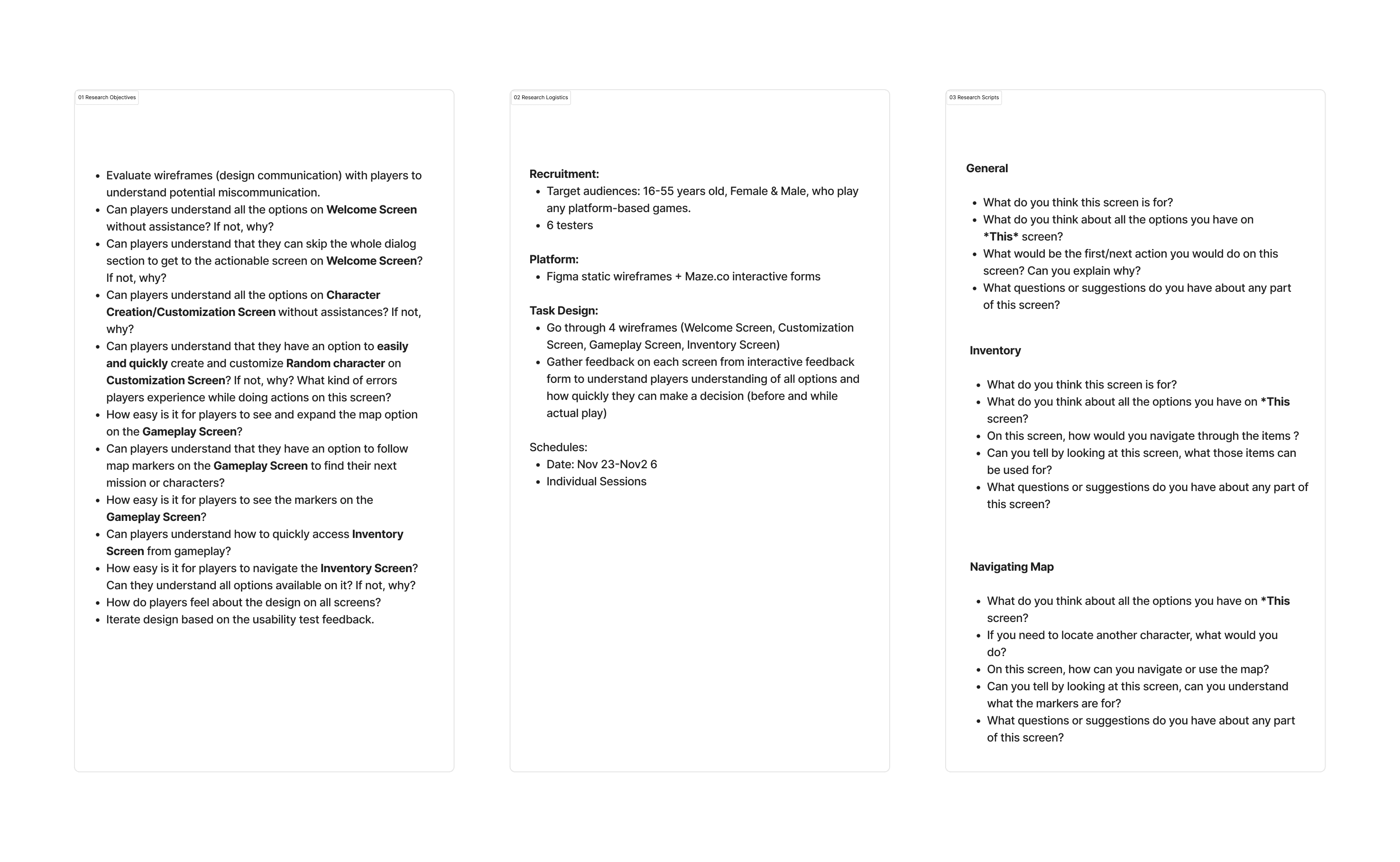
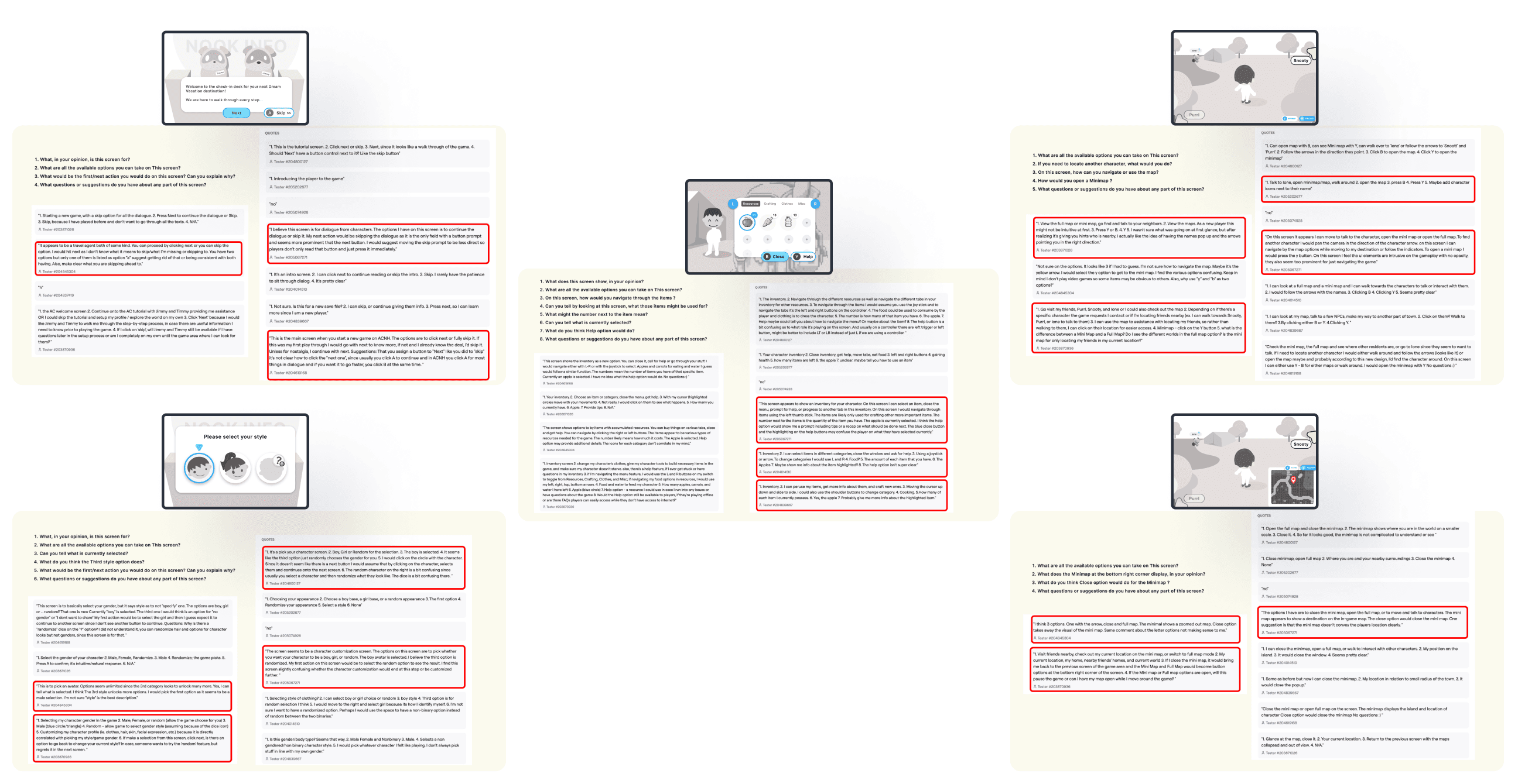
Usability test gave me a good insight into some issues in the wireframe designs and structure of the screens, here is the summary of the main findings from the user feedback:
Welcome Screen: Skip action button is too prominent, make it consistent style with another action
Welcome Screen: It is not clear what exactly Skip action does with the dialog
Gameplay/Minimap: Not clear the difference between Minimap and Full Map
Gameplay/Minimap: The buttons for opening mapzs felt too intrusive
Gameplay: Some users thought it would be valuable to have character icons with the direction arrows
Avatar/Character Builder: Not clear if player is able to go back or change their selection later
Avatar/Character Builder: Confusing what exactly third option and dice icon (randomize) do
Avatar/Character Builder: Would be nice to have non-gender specific option
Inventory Screen: The Help button functionality seems to get different expected outcomes
Inventory Screen: Not super clear why Close button is highlighted
Figma link to view usability test results.
Revised wireframe designs
Revised wireframe designs
User Interface Design
User Interface Design
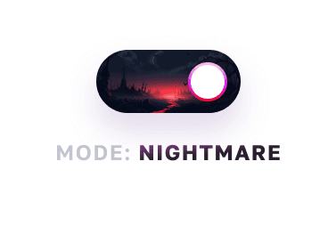
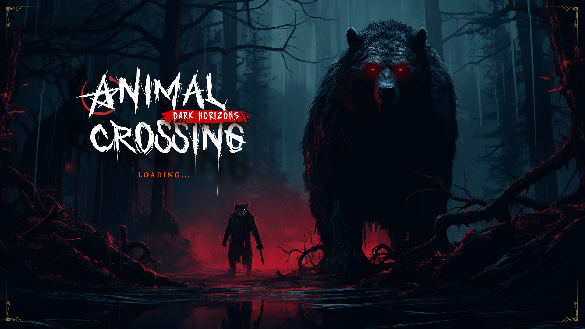
Remaking Animal Crossing UI style into the nightmare/horror genre
Remaking Animal Crossing UI style into the nightmare/horror genre
As part of challenging my own skills in Visual design, I wanted to push the Animal Crossing towards a completely different genre type of game while keeping all the UX design and research, wireframe structure I have built up to this point, diverging drastically from the game's fun, colorful, Nintendo-style, kid-friendly origins.
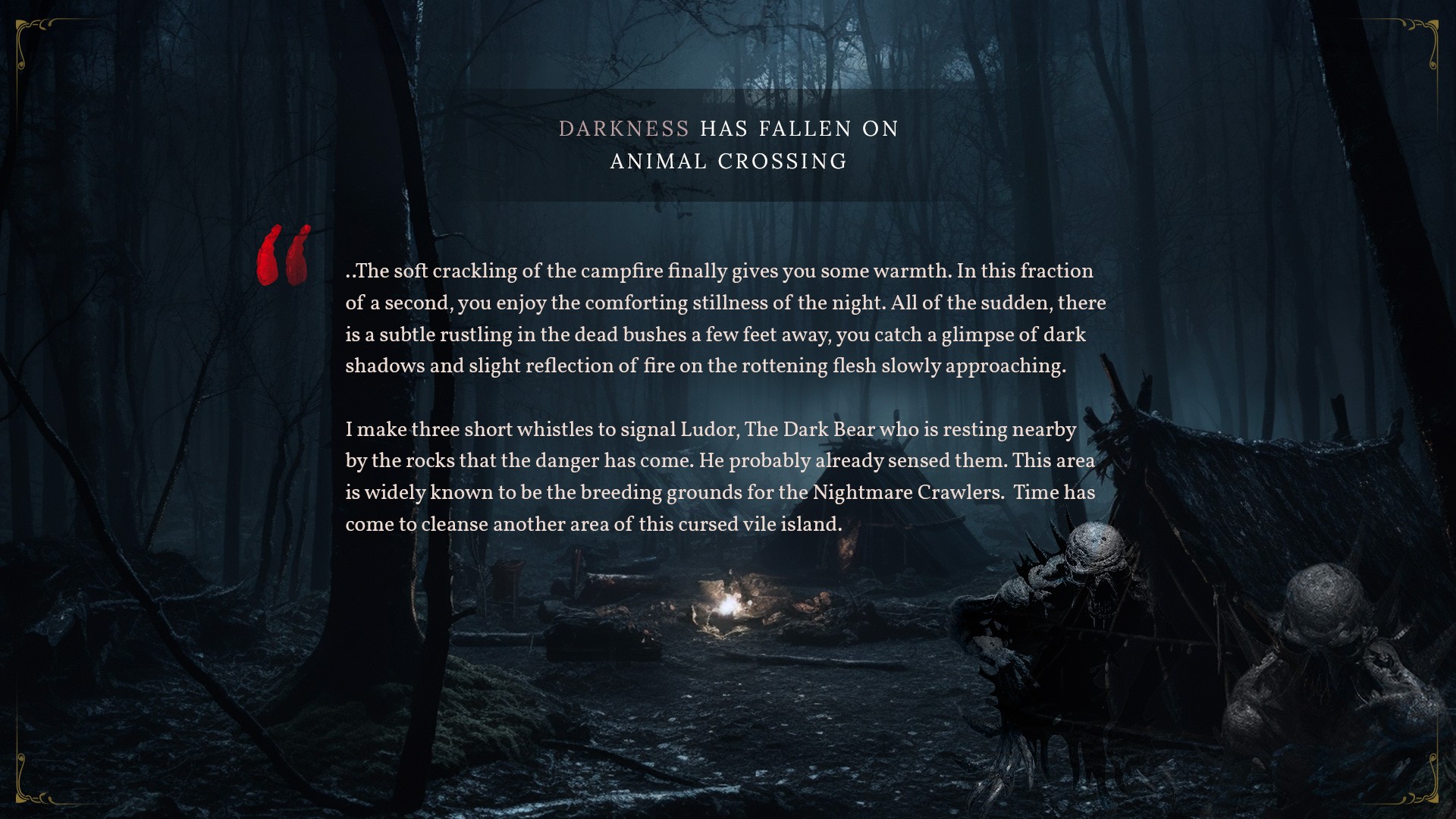
This meant I needed to re-imagine Animal Crossing as a nightmare horror genre for mature audiences, similar to Elden Ring, Demon Souls or Bloodborne. I wanted to add chilling aesthetics, employing ominous, subdued, low-vibrant color palette, dark graphics and characters, sinister visual elements with very careful use of accent colors and effects.
Moodboards
Moodboards
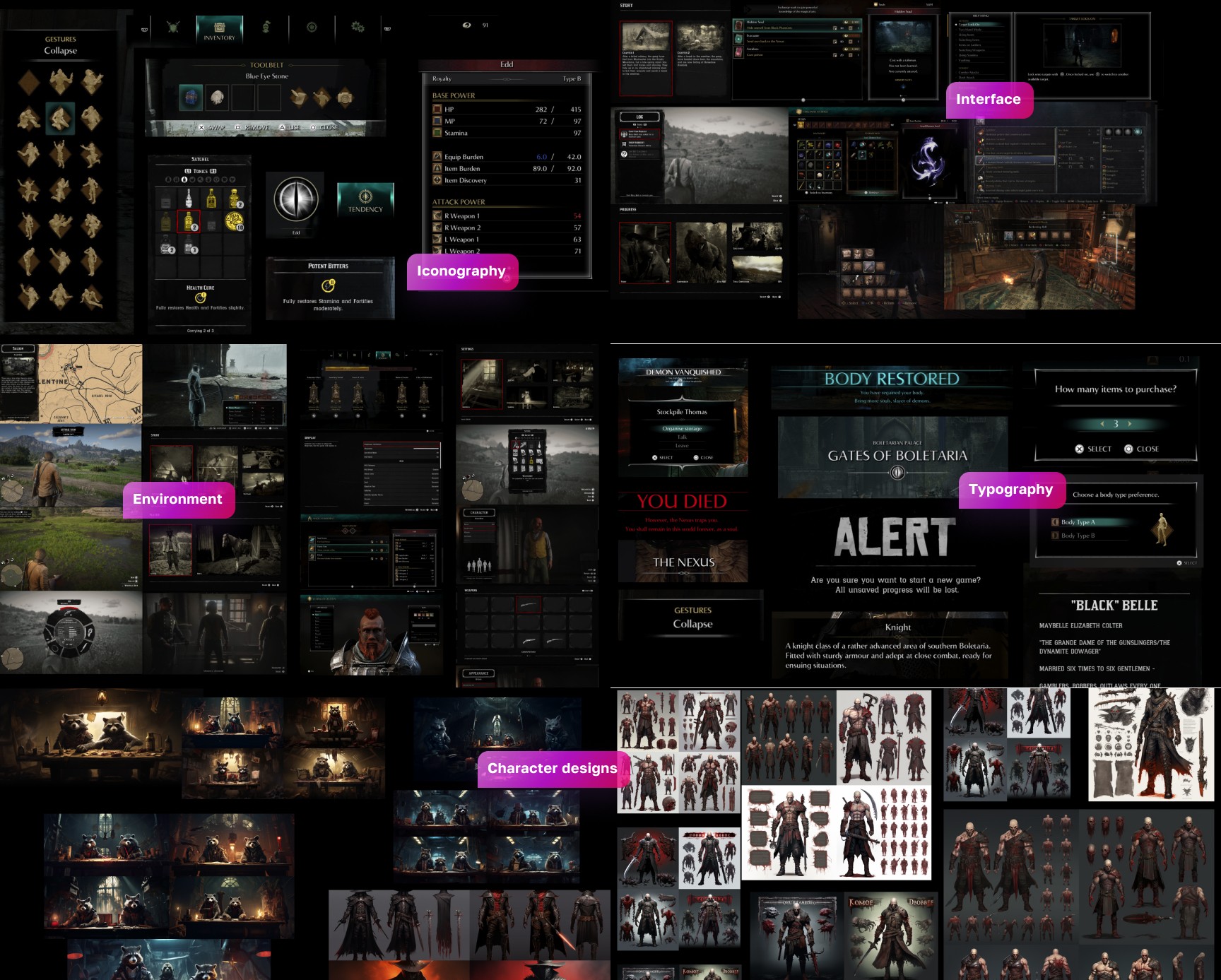
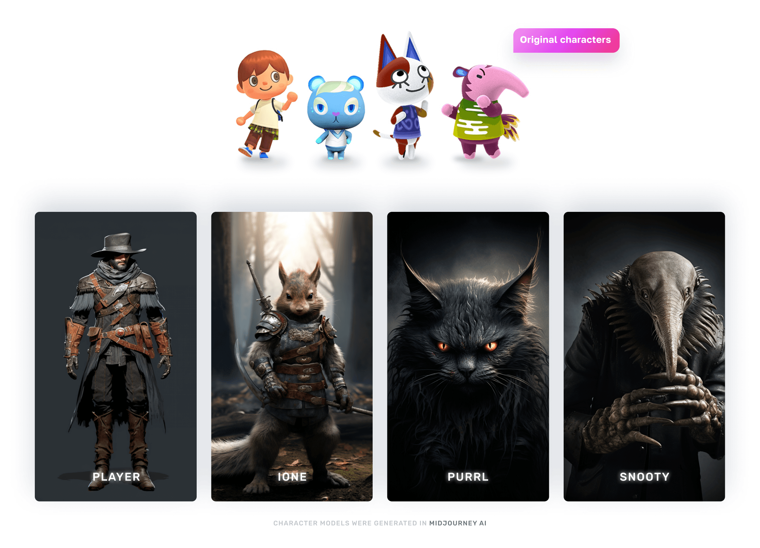
Character design concepts
Character design concepts
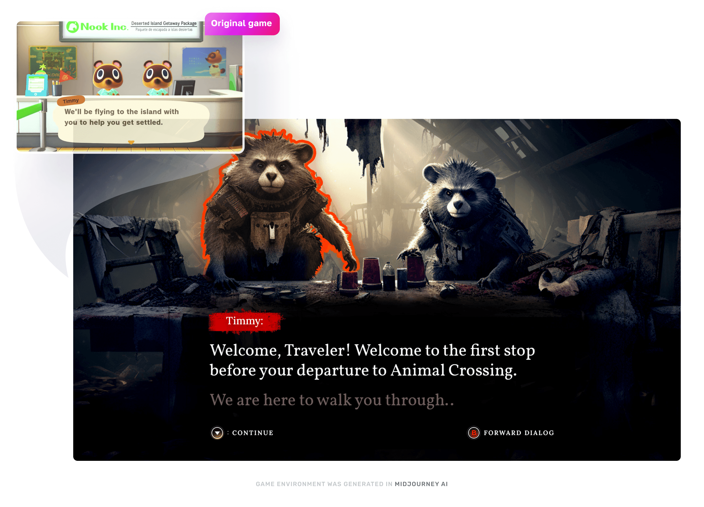
Welcome/dialog screen UI design
Welcome/dialog screen UI design
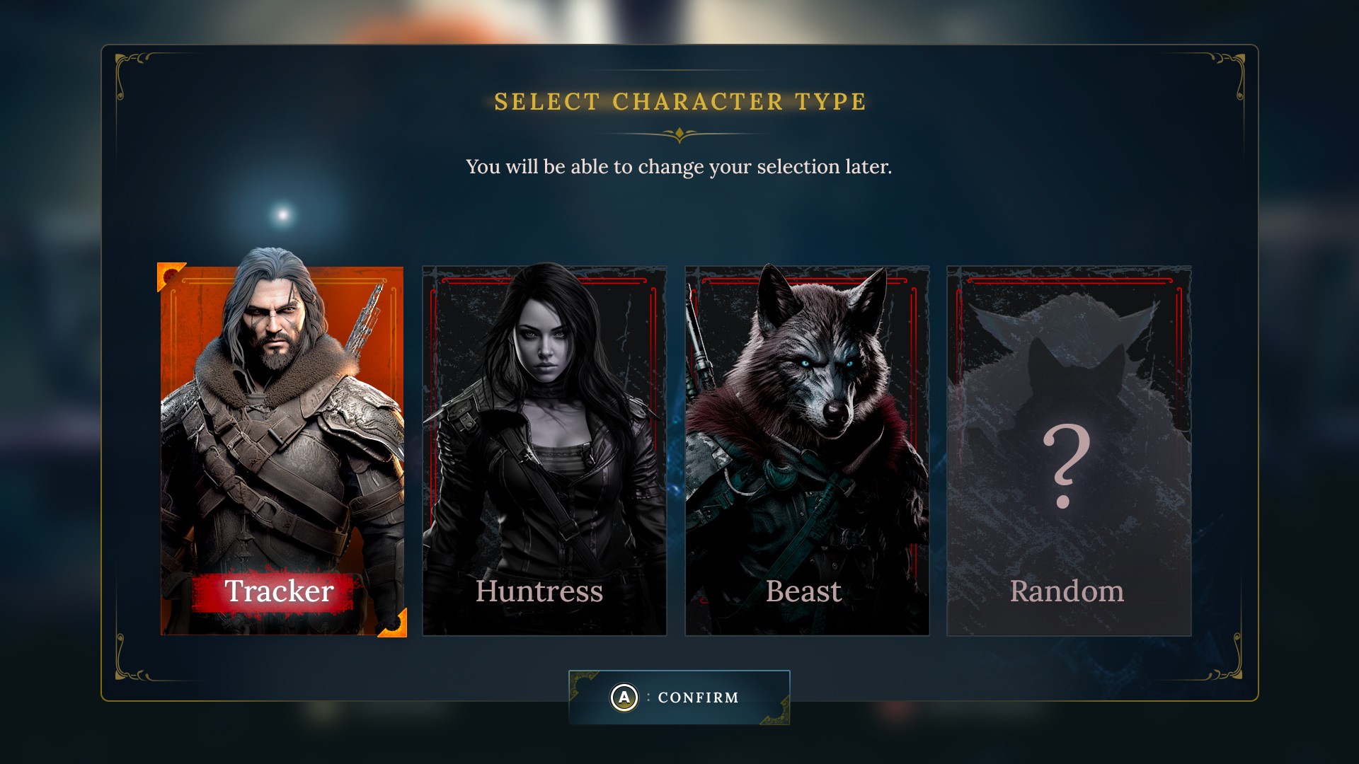
Character selection screen UI design
Character selection screen UI design
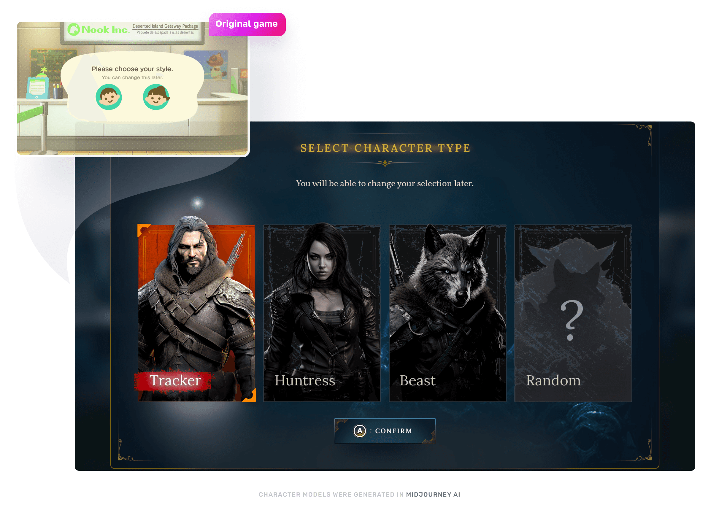
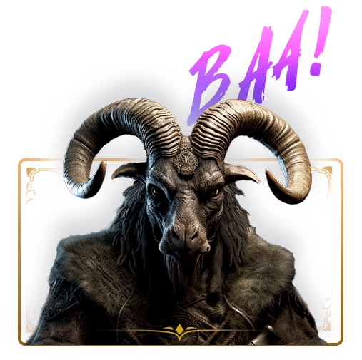
While designing this screen, I decided to add the third class/type option for the character to follow game's theme and style. I wanted to give an option to select non-human character that I thought would also go better with the animal theme of the game. This was also something I thought of in early stages of UX research when analyzing various screens for potential enhancements for the player.
Instead of genders, I have named various character styles Tracker, Huntress, Beast and Random option to not be so gender-specific in the game.
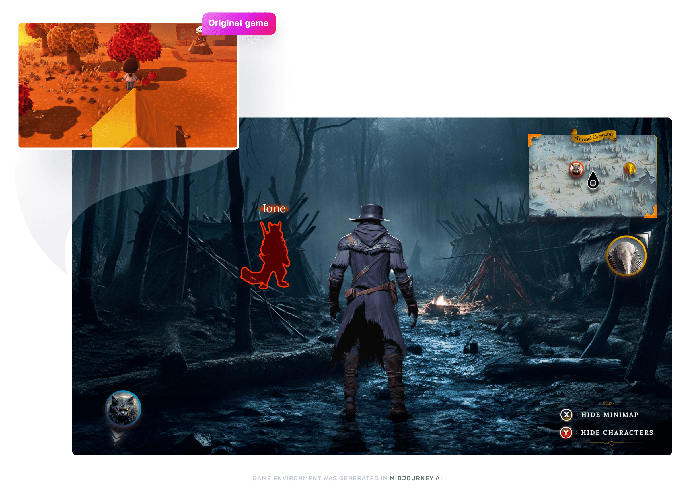
Gameplay UI design
Gameplay UI design
Inventory screen UI design
Inventory screen UI design
Accessibility tests (colorblindess)
Accessibility tests (colorblindess)
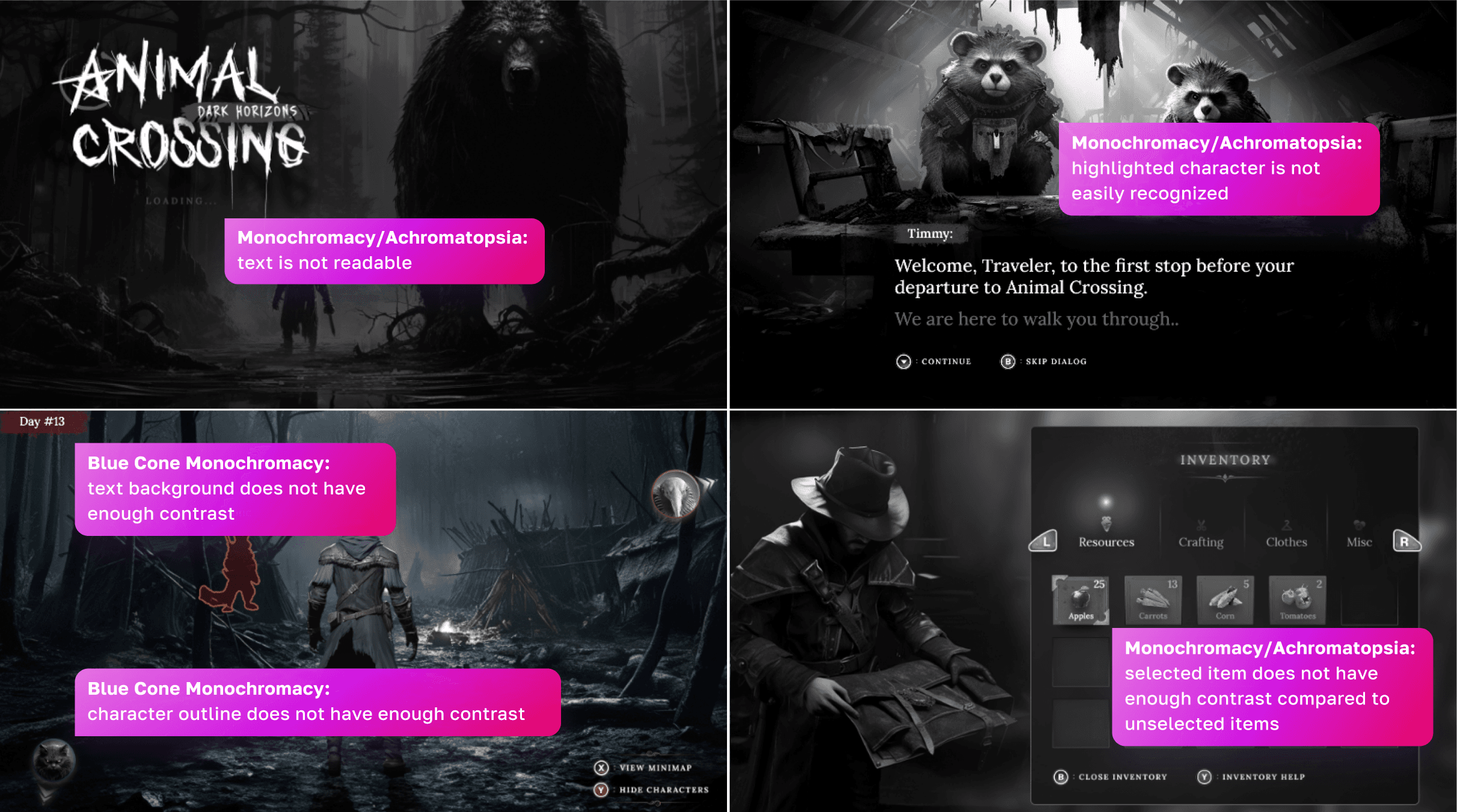
For the colorblindess test, I have ran 10 UI screens I have designed through 5 different colorblindess conditions.
Dichromatic:
Red/Blind Protanopia
Green-Blind/Deuteranopia
Blue-Blind/Tritanopia
Monochromatic:
Monochromacy/Achromatopsia
Blue Cone Monochromacy
Total of 50 screens were analyzed and compared for each condition, I went through and fixed main readability and legibility issues. Most accessibility issues were present for people with Monochromacy/Achromatopsia and Blue Cone Monochromacy.
To see the full test, view this Figma link.
Final UI Designs + Style Guide
Final UI Designs + Style Guide
Motion Graphics
Motion Graphics
Outcomes & Insight
Outcomes & Insight
10
10
10
UI game screens created
UI game screens created
50
50
50
Accessibility tests for colorblindness
Accessibility tests for colorblindness
10
10
Users participated in usability tests
Users participated in usability tests
35
35
35
Total hours spent on the project
Total hours spent on the project
6
6
6
Tools utilized: Photoshop, Illustrator, After Effects, Figma, Maze, Midjourney
Tools utilized: Photoshop, Illustrator, After Effects, Figma, Maze, Midjourney
Design Style Guide*
Design Style Guide*
Design Style Guide*
40+
40+
40+
Character concepts and environments generated in Midjourney AI
Character concepts and environments generated in Midjourney AI
3
3
3
Motion graphics created
Motion graphics created
Success story
Success story
It was truly an exciting, challenging and educating 8 week experience. It gave me an opportunity to deep-dive into the UX and UI design for the gaming industry, learn the industries research techniques and have a much better understanding of the importance for user research and accessibility. The whole course was led by Ivy Sang, Head of UX and UI at Blizzard, getting her perspective and learning from her experience in the design industry was priceless.
My main achievements for this project:
Dove deep into UX research and methodologies for the project
Gained better understanding how UX/UI designer's role fits in between Game Developer and Players
Improving, iterating and enhancing UX experience for an existing game
Applying completely different art and game style to the game while keeping intact initial UX, wireframes and game mechanics ad rules
Biggest challenge I was trying to solve is how to communicate rules of the game and mechanics to the players in most intuitive and clear way, while also making it fun
Utilized AI to generate various models and environments to communicate my vision for the new style
Future improvements
Future improvements
In general, Animal Crossing could benefit hugely from player-generated content: from custom characters, to the maps and different island configurations. I think it will be cool in the beginning of the game where you select your island, to have ability for players to build their own islands, add few more terrain options: mountains, snow, sand, some water options. Social aspect could be super fun in this because players would be curius to explore more islands and make new friends online. I also think introducing AR technology could be something fun, where players can projects their islands in their physical environment and have other players interact with it.
In general, Animal Crossing could benefit hugely from player-generated content: from custom characters, to the maps and different island configurations. I think it will be cool in the beginning of the game where you select your island, to have ability for players to build their own islands, add few more terrain options: mountains, snow, sand, some water options. Social aspect could be super fun in this because players would be curius to explore more islands and make new friends online. I also think introducing AR technology could be something fun, where players can projects their islands in their physical environment and have other players interact with it.
check out Other projects:
mobile app design, UX, UI, User research, Prototyping, illustrations, game design, web design, project management
mobile app design, UX, UI, User research, Prototyping, illustrations, game design, web design, project management

Let's build something sweet!
Need someone to solve your UX/UI headaches? That's me. I freelance. I design. I also love talking fantasy football, sci-fi or board games when I'm not pushing pixels. Let's chat.
Designed by Human. Inspired by robots.
202X
Let's build something sweet!
Need someone to solve your UX/UI headaches? That's me. I freelance. I design. I also love talking fantasy football, sci-fi or board games when I'm not pushing pixels. Let's chat.
Designed by Human. Inspired by robots.
202X
Let's build something sweet!
Need someone to solve your UX/UI headaches? That's me. I freelance. I design. I also love talking fantasy football, sci-fi or board games when I'm not pushing pixels. Let's chat.
Designed by Human. Inspired by robots.
202X